Ezra Stoller

Ezra Stoller
1915-2004
THE GUGGENHEIM, ALMOST EMPTY
Stoller was born in Chicago, USA. He was an architecture student at The New York University. This is where his interest in photography began, when he started making lantern slides and photographs of architectural models, drawings and sculpture. He graduated in 1938 and after that he concentrated on photography
He took many photos of famous landmarks of modern architecture, including the Ludwig Mies van der Rohe's Seagram building. Because of this; Stoller is often cited in aiding the spread of the modern movement.
He was the first person to receive a gold medal in photography In 1961 by The American Institute Of Architects. Many of his photographs are featured in Modern Architecture books.
I like this photo because of the contrasting colours used. Stoller uses the shadows and textures found in buildings to create a contrasting image like this where it is black and white. Not only is it black and white but the black bits are very dark and the white bits are very bright. This helps the image stand out more. Stoller takes his pictures from a high vantage point which allows more things to be in view, for example in this picture you can see two people at the bottom and two people in one of the levels.
HDR toning
HDR toning is a process of staking layers upon each other to create an effect where the photo stands out a lot and look very sharp. Instead of doing this long winded process, you can now just do it on photoshop. It is simple and very effective as the pictures look very good, maybe even better than when you do it using the the layer stacking process.

Here you can see a church with the HDR effect applied. As you can see the photo looks a lot more prominent. The shades of the church look a lot darker than it should and the sky stands out a lot and also looks darker than it should. The picture overall is quite dark and has a sort of smokey effect I feel. This looks as if it's from a movie such as harry potter in my opinion because it gives of a bit of a magical vibe in a way.
Photoshoot 1


Refined photos

Here I have taken a picture of a ledge on a local church. As you can see from the pictures above, most of them look pretty dull and normal. I added some HDR toning to make the picture look more detailed and to look quite sharp. I like this photo because it is in a similar style of Ezra Stoller but more modernized with the HDR toning.

Here I have taken a picture of the roof and spire on a local church. As you can see from the pictures above, most of them look pretty dull and normal. I added some HDR toning to make the picture look more detailed and to look quite sharp. I like this photo because it looks quite modernized with the HDR toning.

Here I have taken a picture of a wall that's part of a local church. As you can see from the pictures above, most of them look pretty dull and normal. I added some HDR toning to make the picture look more detailed and to look quite sharp. I like this photo because it is quite modernized with the HDR toning. I especially like this photo because of the dead vines crawling up the wall and with the HDR toning it almost looks as if its not a wall.
Photoshoot 2


Refined photos

This is my edited version of a picture of a spiral staircase. I took this picture in the day time and turned it into a black and white photo to try make it look more dark. This work was influenced by Ezra Stoller and as you can see I've adopted his sort of style. As I have chosen architecture, I made sure I took some pictures of buildings with peculiar shapes and this staircase stood out to me because of its circular shape.

Here I have used HDR toning for the very first time.I stumbled upon the method when I was looking for ways to make my images look sharper and make the edges look more refined. As you can see I have worked on making the shadow in the door way look quite dark which I personally think looks good with the orange bricks as they contrast well. The photo reminds me of an old, red bricked train station and the shadow gives it that mysterious, shady feel which I like quite a lot.
Photoshoot 3


Refined Photos

In these two photos, I have added HDR toning. This is in the similar style of Tim Clark. It almost looks animated or like a drawing which reflects on Clark's work. The detail of the bricks and the various colours stand out a lot which makes the pictures look a lot better. On the photo below there is some dirt/grime on top of the roof on the left hand side, which I think personally with the HDR toning makes it stand out a lot which makes a good contrast between the clean parts of the photo and the some what dirty part. Because of the effect, the sky is made to look a lot darker than it actually is and makes it look as if it's about to rain. This also fits in well with the dirty roof. I like the picture above more because I feel as if the colour scheme is a lot more stronger. The dark sky contrasts with the oranges and reds that make up the building. Because the picture is shot with quite a wide angle and it gives of the sense that someone has drawn it. You could almost imagine a person sat where the camera is; painting the scene, and because of the HDR toning effect, It makes you wonder if the photograph is a photograph or really is a painted picture.

Tim Clarke

Tim Clarke has been a photographer since the 80s. As well as being a photographer, Clarke is a professional creative director with more than 25 years of work experience in graphic design and web development. He specializes in HDR photography and his website has over 400 photographs of landscape, vehicles, sunsets and the sky all using HDR toning.
I especially like this and some of his other photos because of the way he has used the HDR toning effect. Here he has taken a picture of a building on a water front. The HDR toning really makes the ripples in the water stand out and makes the colours look very vibrant, especially the little boats at the front, it almost makes the look fake. The glass structures look very nice as they also share the fact that it doesn't look real. It reminds me of some type of cartoon or video game.
I especially like this and some of his other photos because of the way he has used the HDR toning effect. Here he has taken a picture of a building on a water front. The HDR toning really makes the ripples in the water stand out and makes the colours look very vibrant, especially the little boats at the front, it almost makes the look fake. The glass structures look very nice as they also share the fact that it doesn't look real. It reminds me of some type of cartoon or video game.
HDR toning experiment with my old Photos from Paris 2015


As I am currently researching architecture and HDR toning I was looking for some ideas on the internet for what sort of buildings are used. Most of them were churches or fairly modern buildings when HDR toning is applied. So because of this I used some pictures of Paris I took in 2015 when I went there with my school. As you can see the photos above have worked nicely with the HDR toning effect. I feel as if the colours have worked nicely with the effect and again the sky looks very good. This was not a proper photoshoot, only an experiment therefore there is only six pictures.
Phooshoot 4


Ideas for my final piece


This is the first draft of ideas I have for my final piece. As you can see in the pictures I have interpreted the idea of perspective. I printed out the image I wanted to use and then cut out the background leaving only the the building left. I then cut the same shape out on to a piece of cardboard which then gave me the base of my sculpture. As you can see the picture is split in to three different layers which is all different depths of field. I then cut these different sections out and done the same with the cardboard. Then I stuck the images on to their designated cardboard backing. Once aligned I stuck some cardboard strips in between the different layers which made each layer have about a 1cm gap between them. When looked at from the correct position the image looks very 3D.
Final piece and what I'm going to do
For my final piece I'd like to do a city skyline using the same ideas as my ideas above. However I'd like to make a few improvements. Firstly because in the exam I will have 5 hours i will take more time cutting out my images and make them very neat. Also I will apply the cardboard with a thin layer of black spray paint so it blends in with the picture more. Another idea I have is to put a couple LED lights in between the layers so when the image is in a dark room the layers stand out more.


Here I have made my final practice sculpture before my mock exam. As you can see, it looks a lot better than my original draft. Instead of using cardboard and sticking it down with glue, I have used mount board and double sided sticky foam. The sculpture is a lot more sturdy than my one before because it is made using a more solid material and it is also put together better. The double sided sticky foam sticks very well and also creates a gap so I don't have to make a wedge in between to create a larger gap. The mount board is black which helps because the brown cardboard colour stood out a lot.


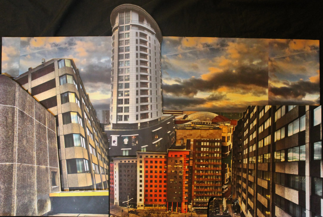
Final piece analysis
Overall I am quite pleased with my final piece. I have used HDR toning to make the buildings look unrealistic and appealing to the eye. The HDR toning was inspired by my researched artist Tim Clark which I feel I have Interpreted into my own work. To make the picture different however, I made certain buildings and structures more 3 dimensional by raising them at different levels. This creates different views of perspective which adds to the overall effect of the piece. To create this piece I took different pictures from around town and then cut out the main structures. I put certain bits onto mount board and raised them to different layers and heights to create an aspect of perspective. I personally like the middle section of the photo because I feel it blends very well. Another feature I like is the tower because of the way I have cut it out so it is higher than the sky because as well as raising it on the mount board, it also creates another element of perspective. The colours used in the picture are also very eye catching which I feel the picture above doesn't do enough justice.
