Seung-Hwan Oh
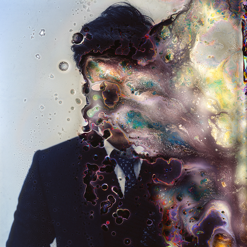
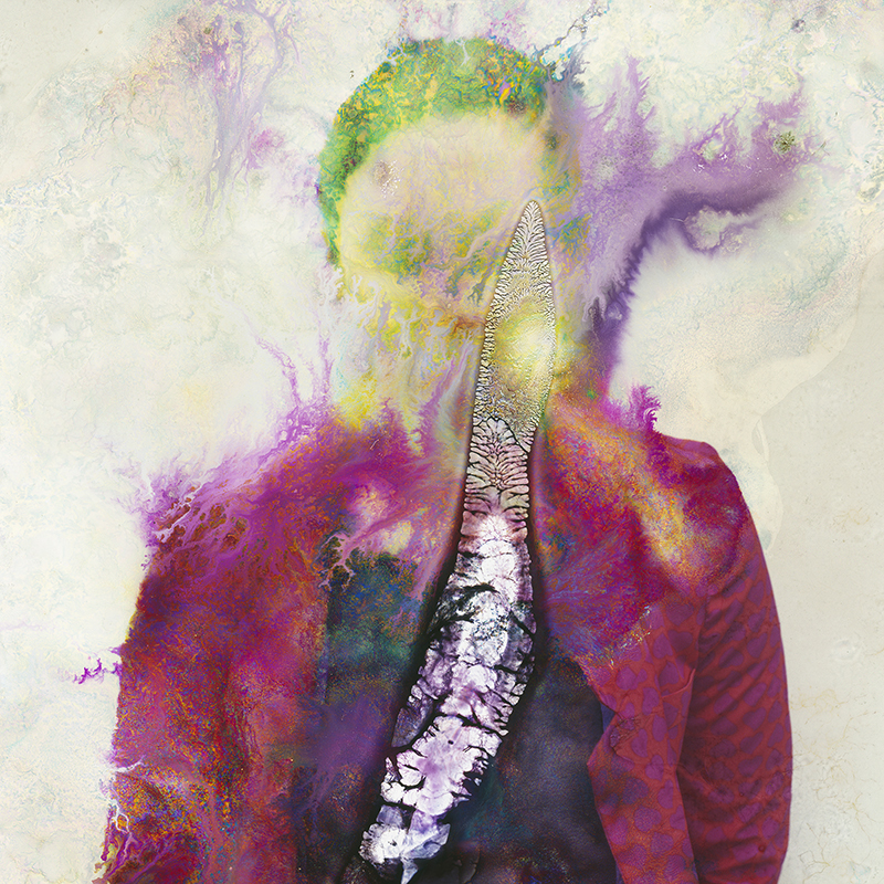
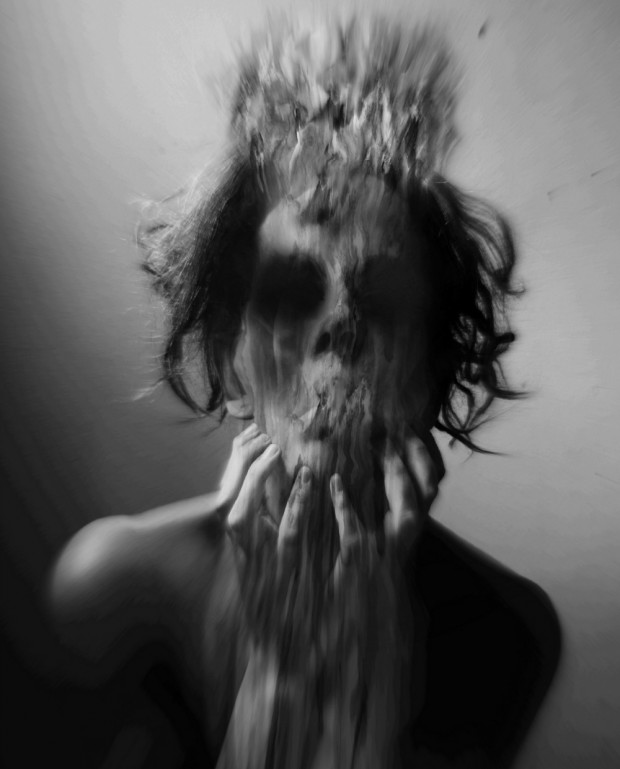
These images are created by Seung-hwan oh aka Tonio Oh. He was born and raised in Seoul but later moved to New York where he studied film and photography at Hunter college. His work and practice stem from his interest and approach towards other disciplinary thoughts and ideas, from philosophy to sciences. His most recent work was inspired by the notion of the first advent of vision in life on earth, and his current work focuses on "implementing microbial growth" on film as a means to explore the impermanence of matter as well as the material limitations of photography. These pictures are titles impermanence.
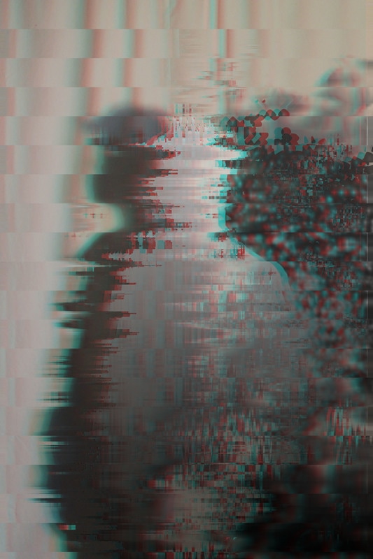
You can see the distorted style is varied in his photos. In picture 1 you can see it looks quite solid and in blobs whereas in picture 3, it looks quite misty and messy.
You can see the distorted style is varied in his photos. In picture 1 you can see it looks quite solid and in blobs whereas in picture 3, it looks quite misty and messy.
Heitor Magno
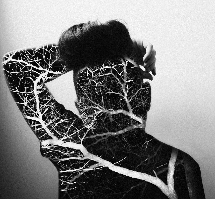
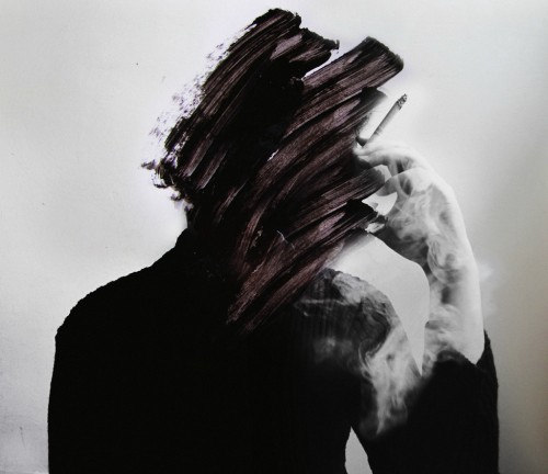
These pictures were created by Heitor Magno. Magno uses a double exposure technique and Incorporates glitch on their faces to convey emotions unknown. Magno has done this to make people question the persons identity and create a sense of mystery. As you can see, the images are all dark, mostly black and white. The pictures don't look like very happy pictures, infact they look very frightening and scary.
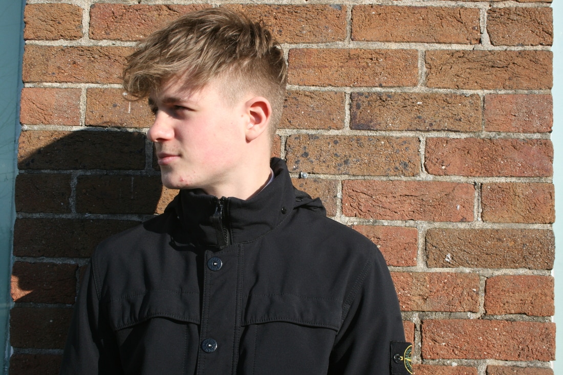
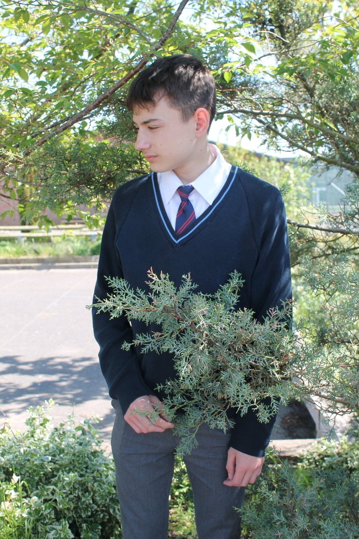
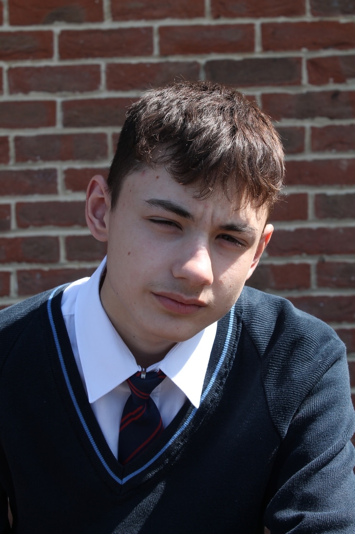
Photoshoot 1
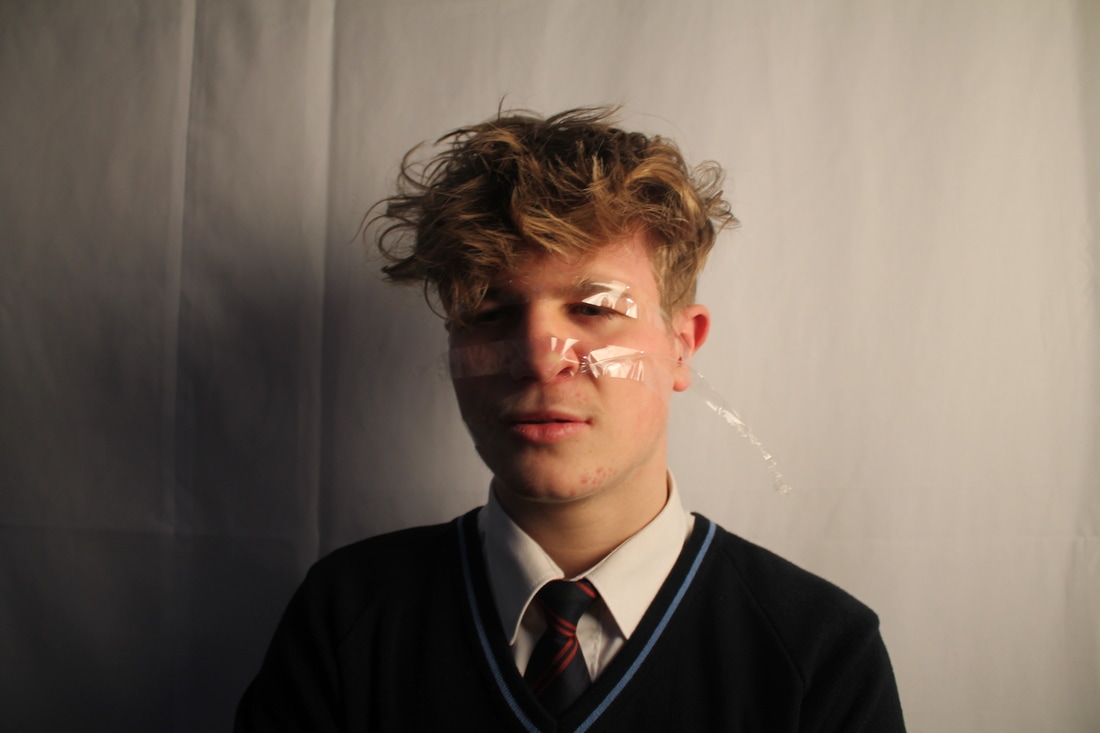
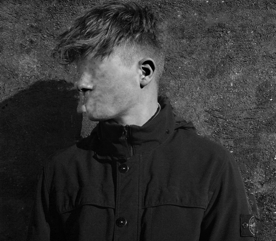
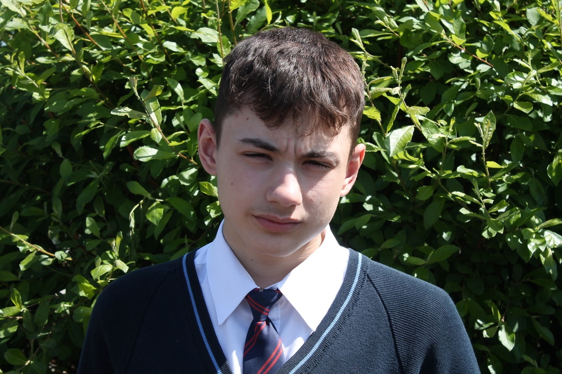
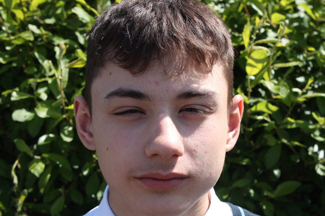
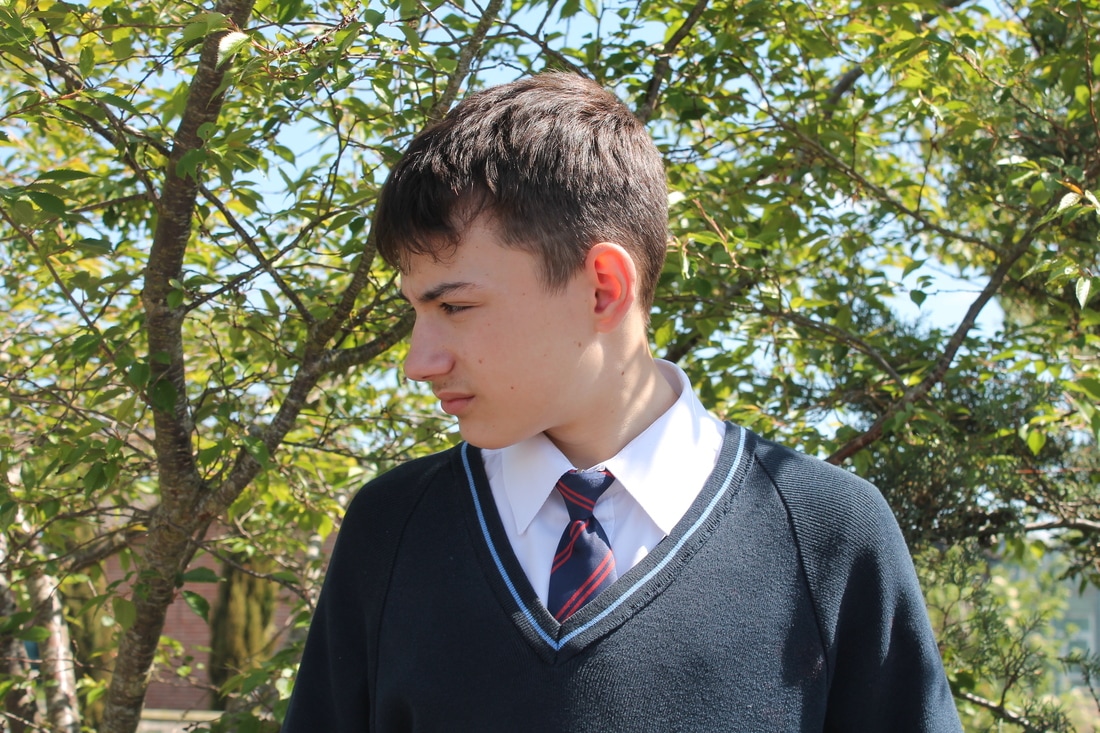
Wes Naman
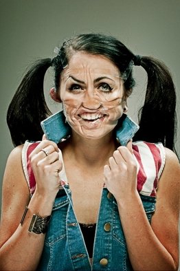
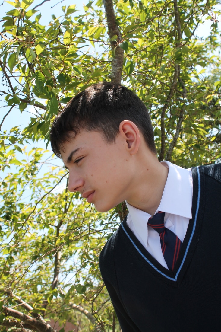
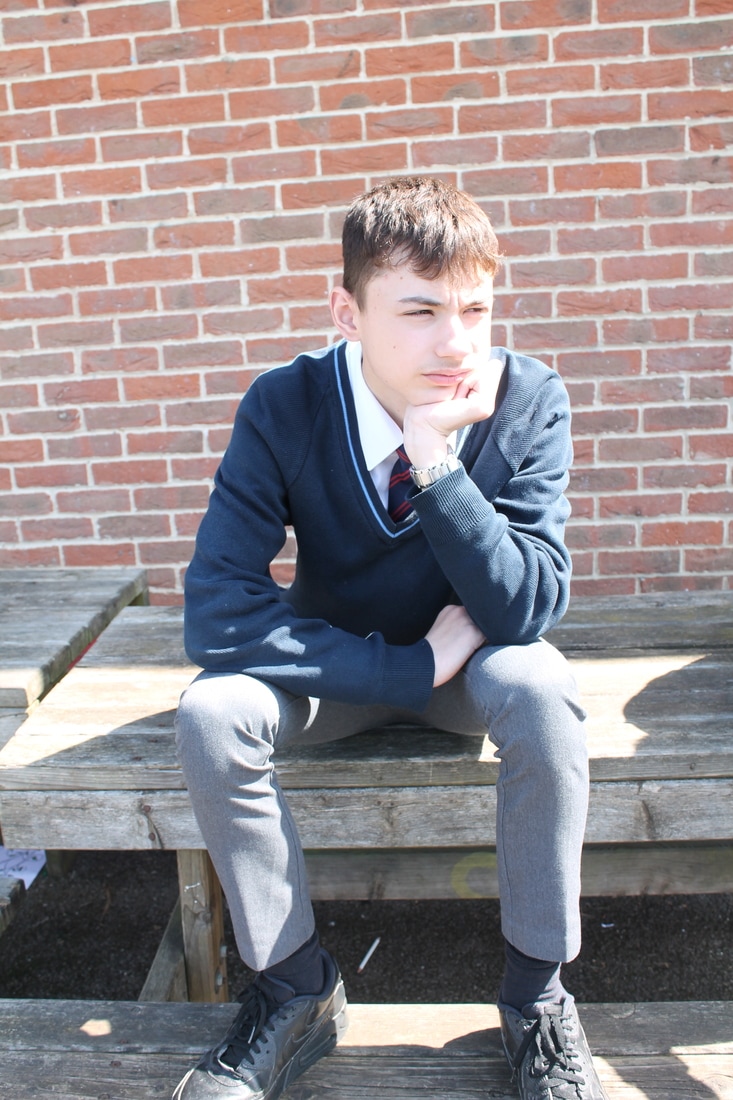
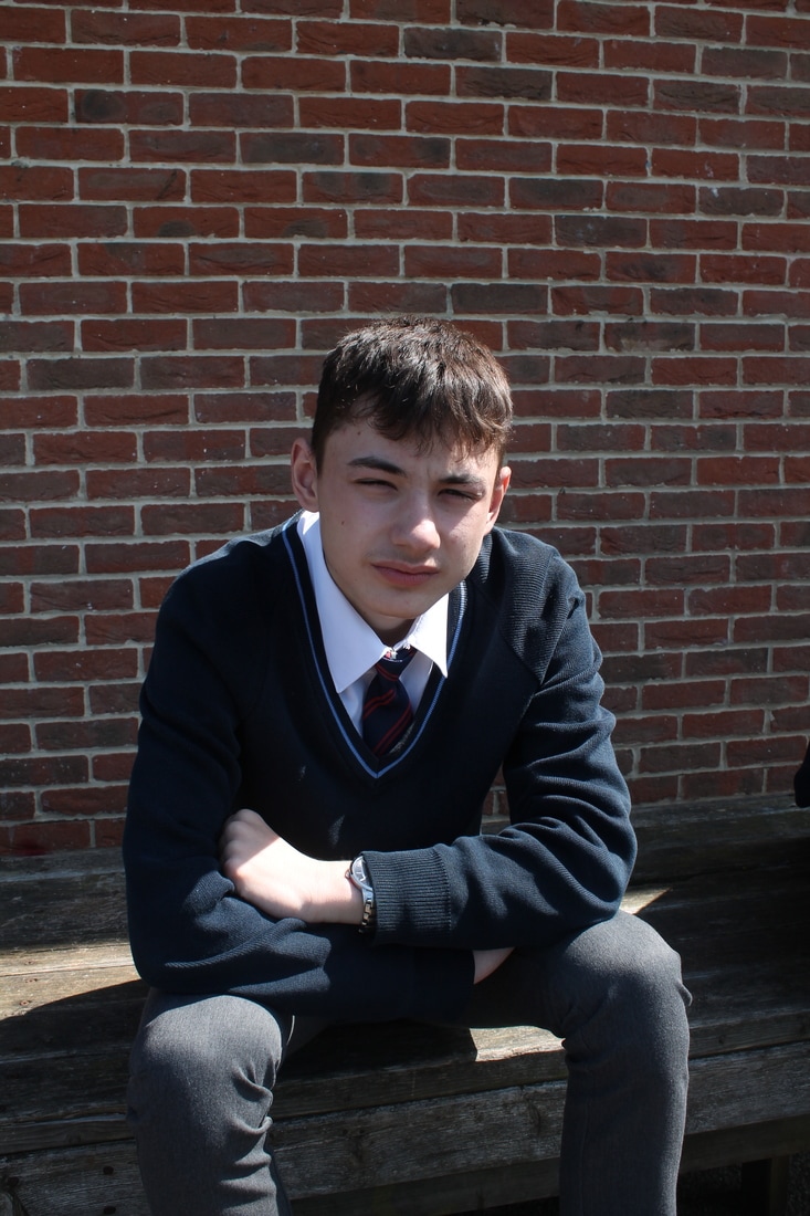
In this photo you can see the womans face is tapped up. Wes has asked the woman to pose in an "unatractive" way and randomally wrapped tape around her face. You can clearly see her ears look twisted and abnormal. She looks very tense and uncomfortable; the way she grabs her collar sugests this. I like how Wes has dressed the woman, it makes the picture look even stranger because she is just a normal woman. To make this picture better I would of put some colour corrections on the picture and made a more exciting backdrop.
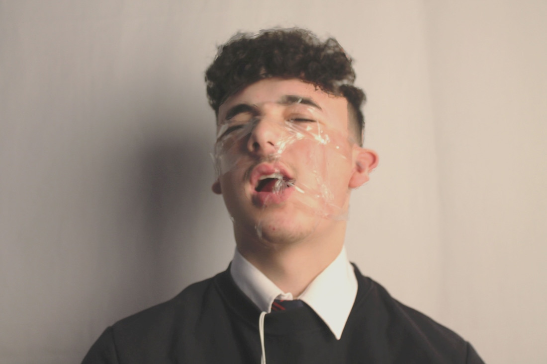
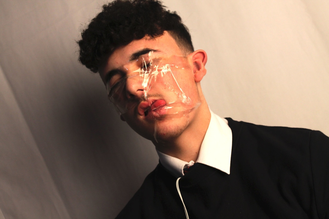
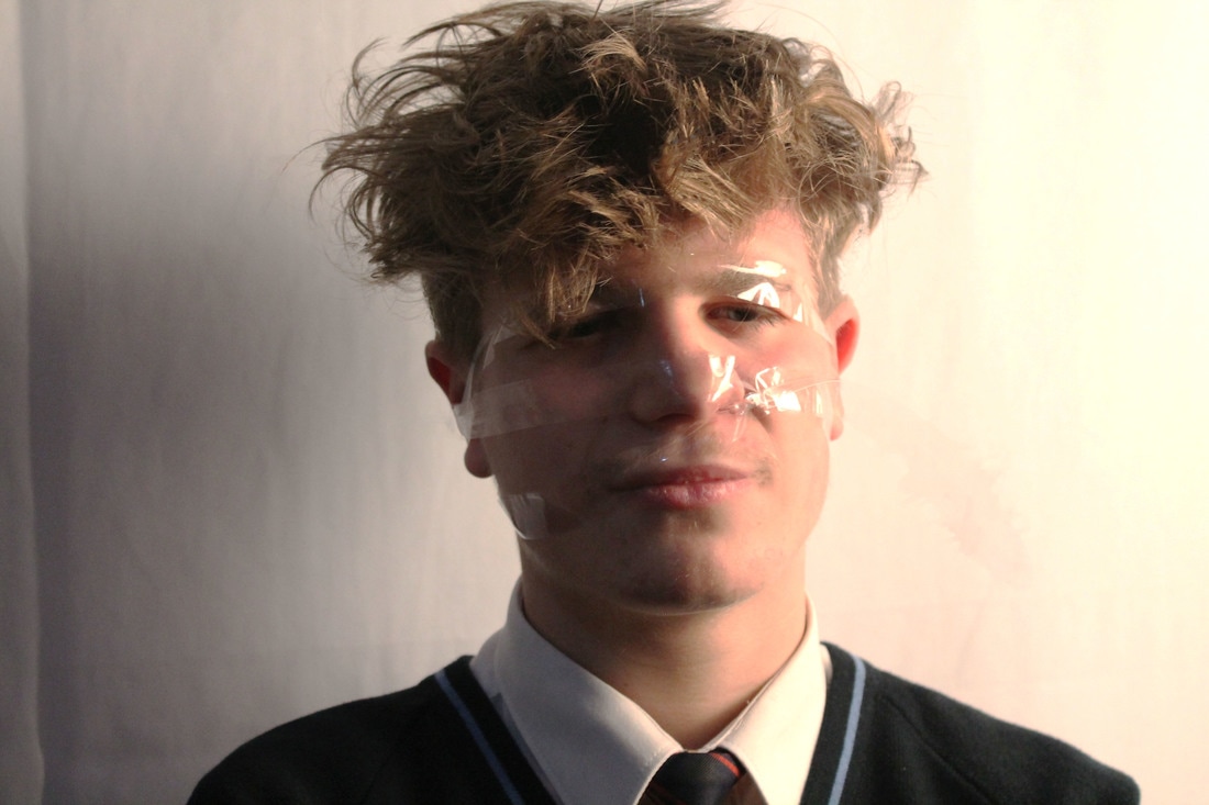
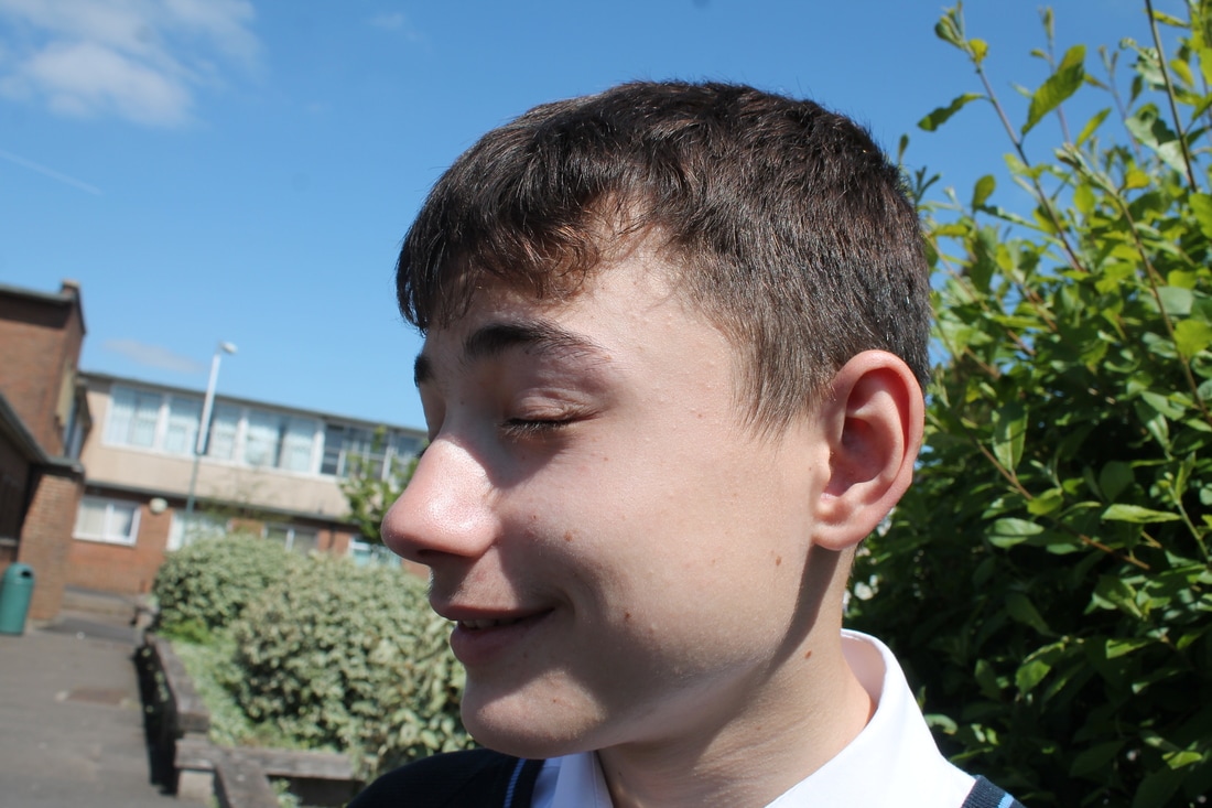
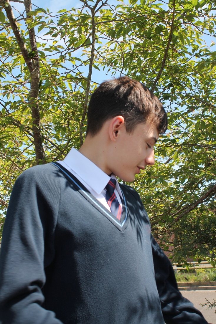
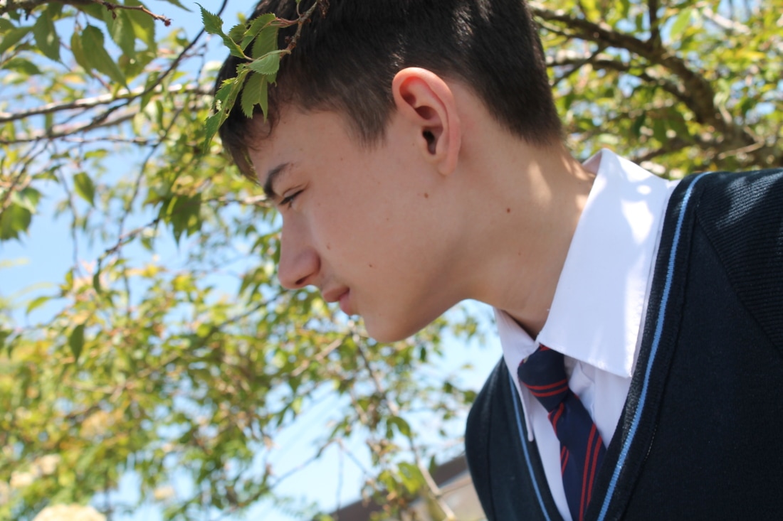
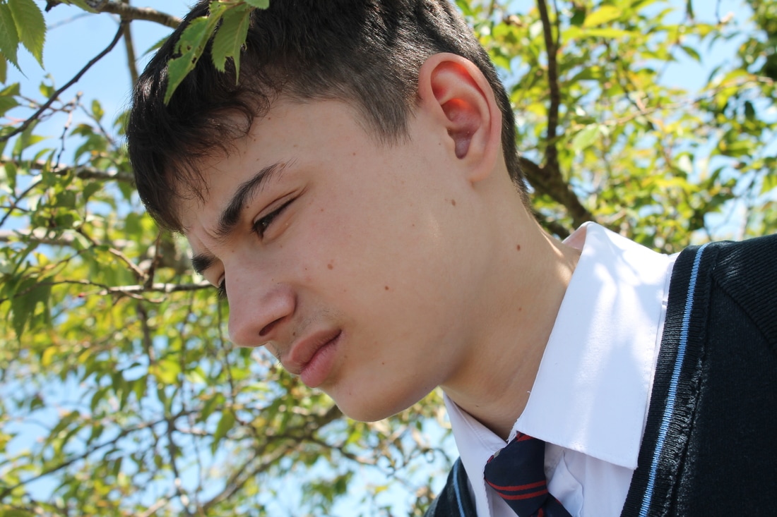
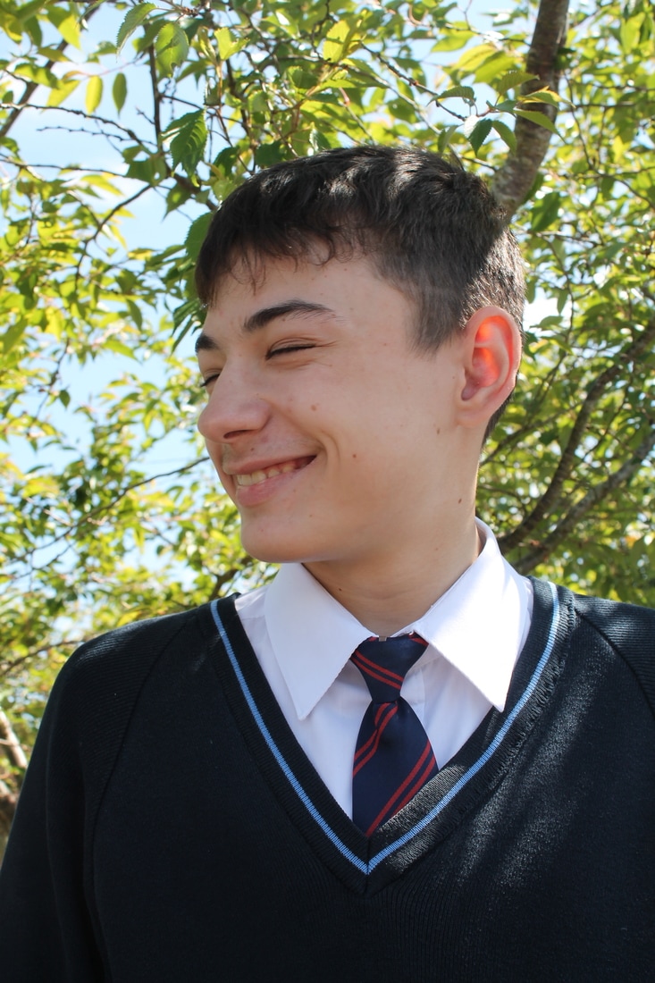
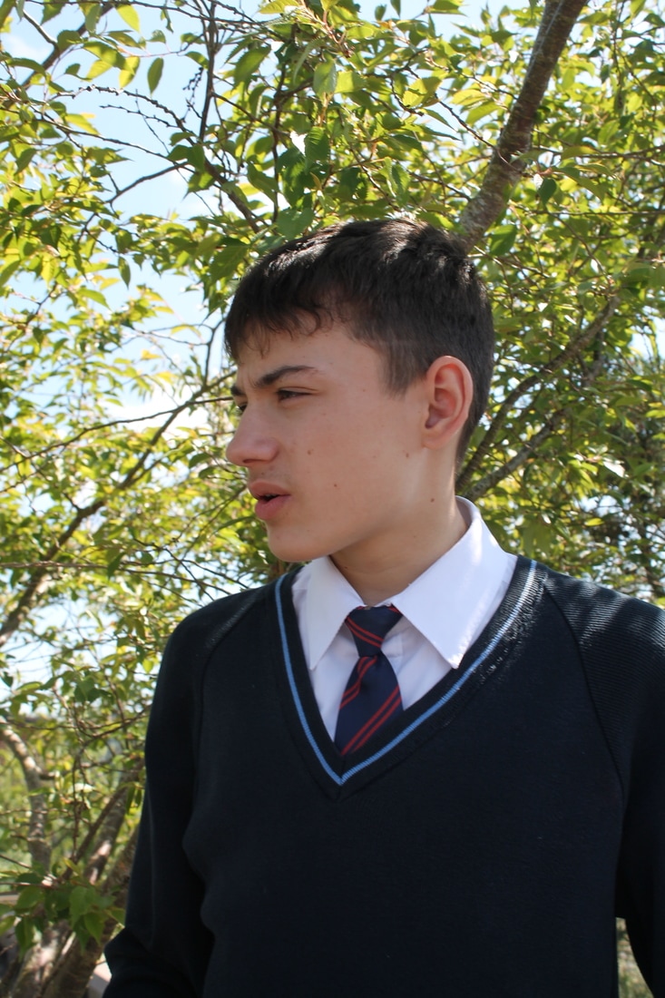
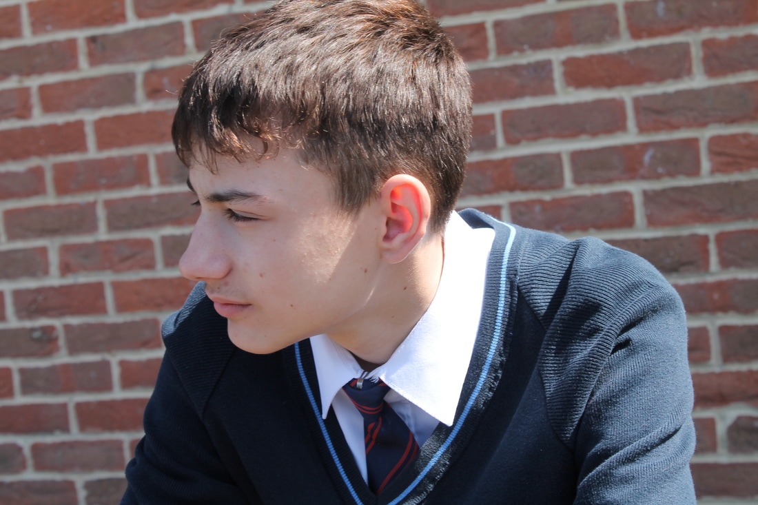
Photoshoot 2
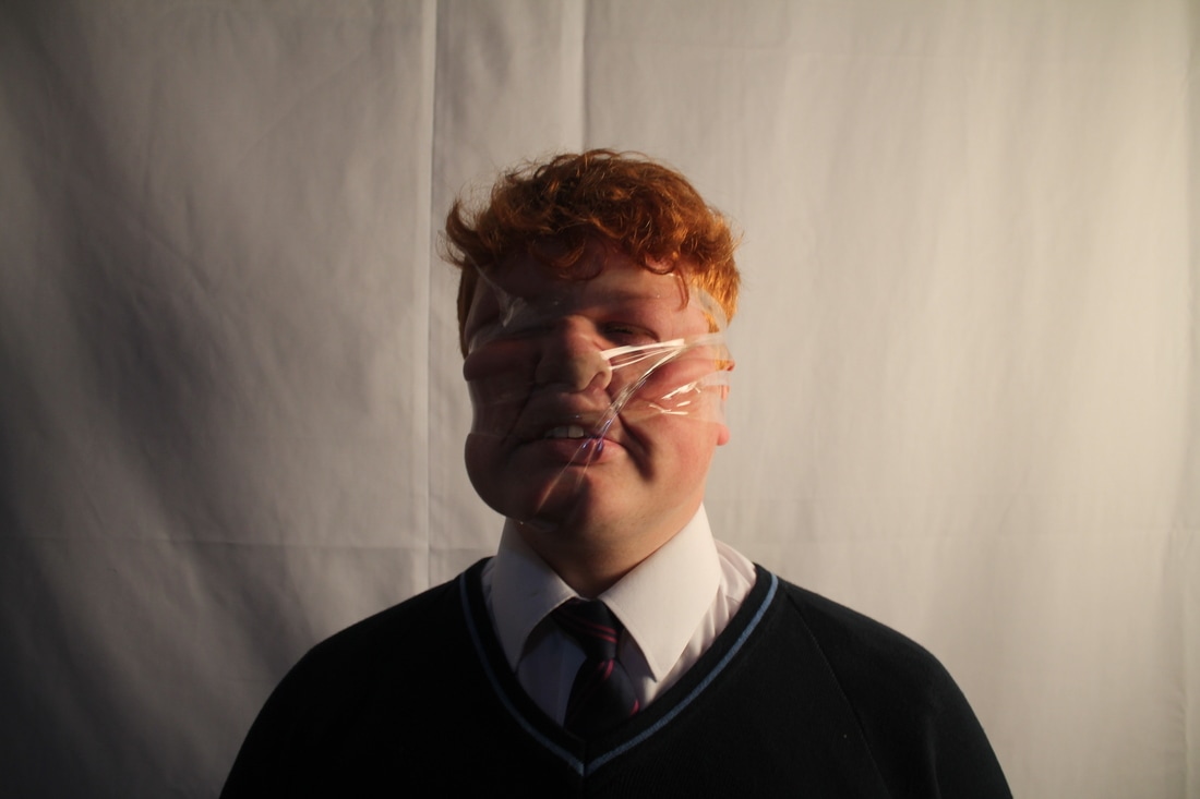
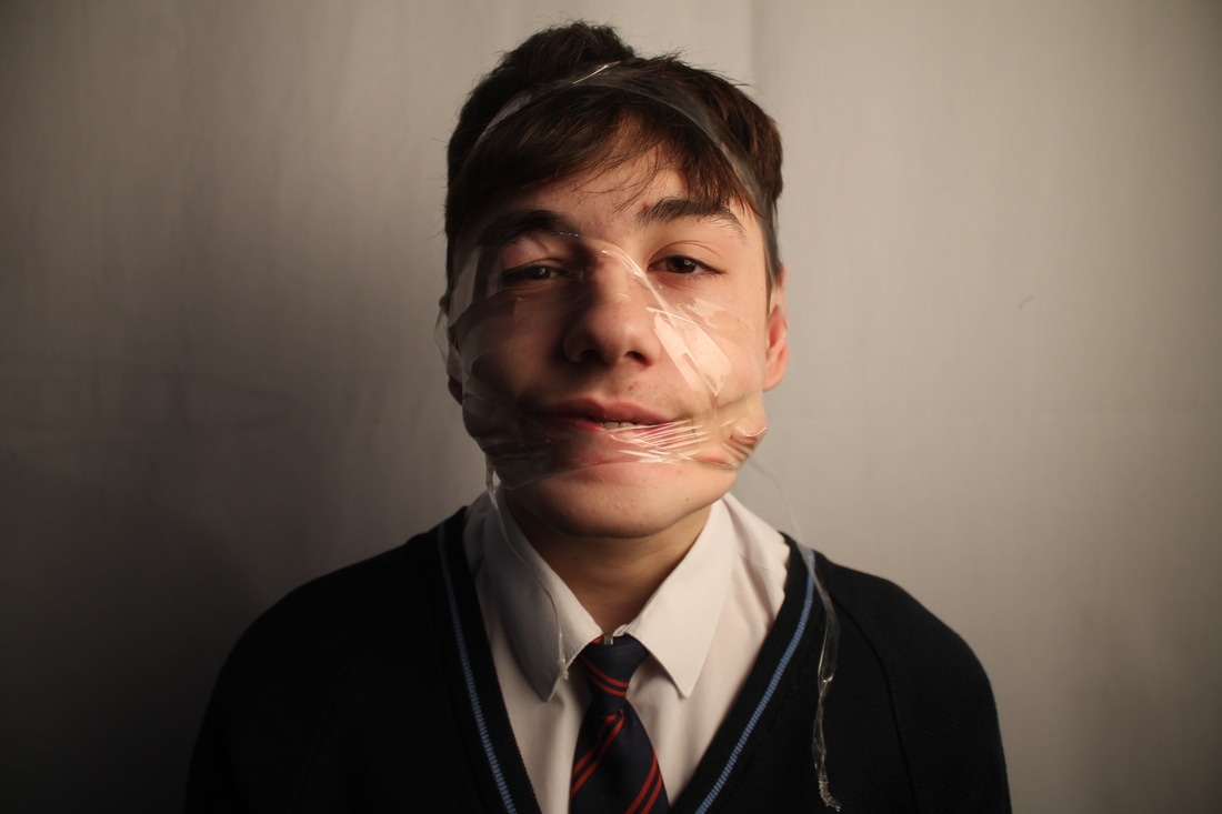
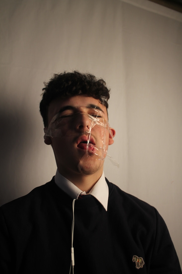
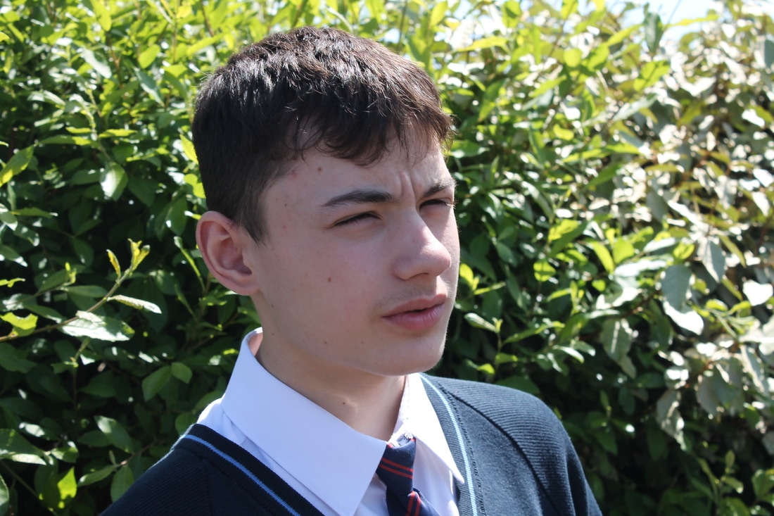
WWW - Good use of tape and lighting
EBI - Could of changed the angles of the pictures and lighting
EBI - Could of changed the angles of the pictures and lighting
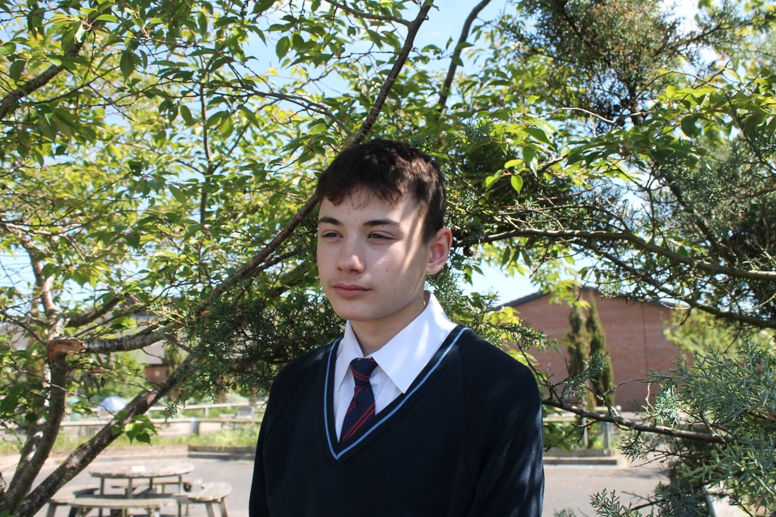
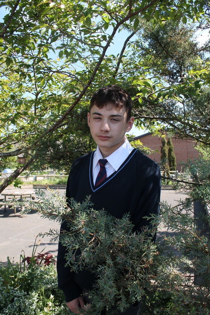
Photoshopped version
Before and after photoshop
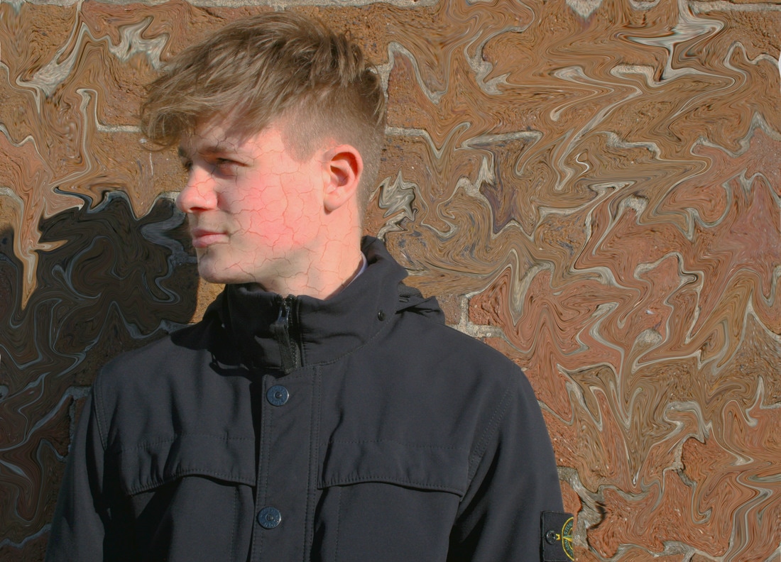
As you can see, I have changed the brightness and contrast to make the photo look a lot smoother.Then I have used the healing tool to get rid of some unwanted marks. I have then used the liquified tool to destroy the background and given it a very messy effect. I have then added some faint cracks to my face by adding another layer to the photo and then changing the opacity. I have also messed about with the HDR toning to give the photo a balanced amount of colours etc.
Image edits
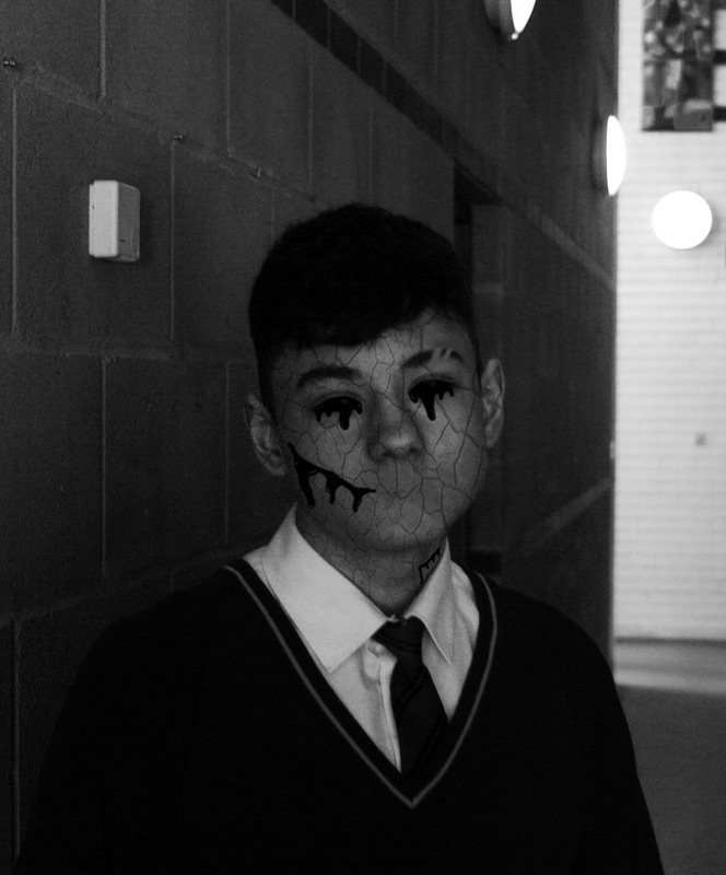
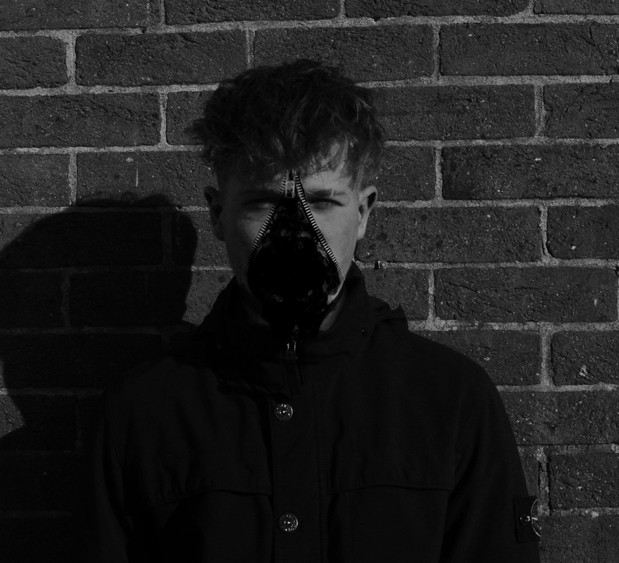
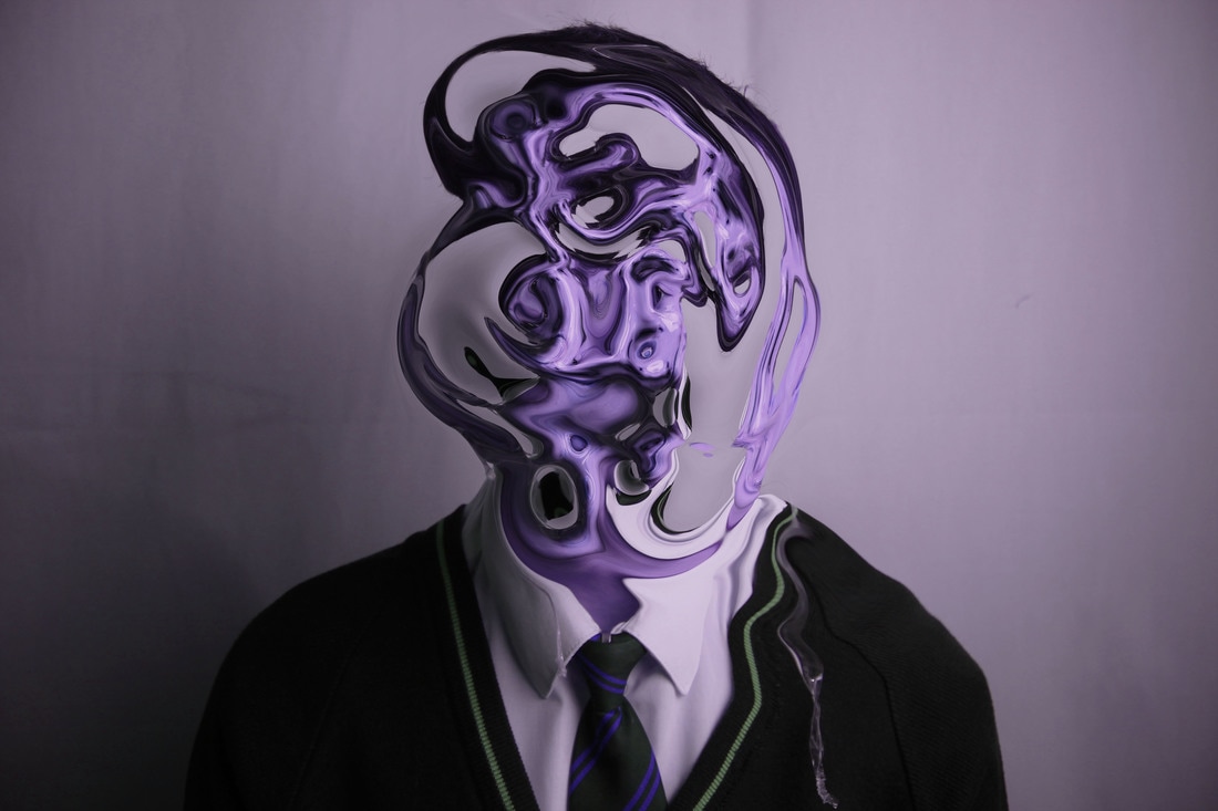
WWW:These are my final images I have created using photoshop. The top 5 images have been inspired by Heitor Magno and the bottom 2 by Seung-Hwan Oh. As you can see the top 5 are very dark and gloomy. They have been distorted in a way to give this effect which is very similar to Magno's. The bottom 2 however are more colourful. They have been distorted in a more liquefied way unlike my others; which are not liquefied.
EBI: To fully understand the process of Seung-Hwan Oh and to explore more ways on how to make my work like his.
EBI: To fully understand the process of Seung-Hwan Oh and to explore more ways on how to make my work like his.
Eugenia Alejos
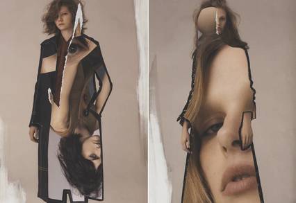
In this photo you can see two separate women stood up wearing what looks to be a longish coat. The coat on the left looks to be black with thin large lines on it, the coat on the right looks similar but you can't really see because of the way it has been edited. Because there has been another person edited onto the coat, it gives of the effect that the coat is actually the colour of the woman's skin. This makes the photo seem a lot more sleek rather than a normal photo shoot.
The artist has made this photo by doing a collage. It looks as if she has cut two separate pictures out with a pair of scissors and also ripped a bit of it to give it that white effect around the face area. She has then stuck them down with glue and cut out the other photo in the shape of the coat and then glued that down as well.
WWW: I like how they have cut around the hands to keep the bodies main features.
EBI: I don't like the tears in the work, it would look better if it was a clean cut.
Next lesson I am going to create a photoshoot taking portrait pictures of someone. Next i will open my favorite photo in photoshop and research a way of creating a double exposure picture. I will then try and make my own version using the technique i have just learnt.


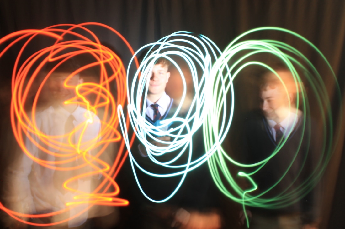
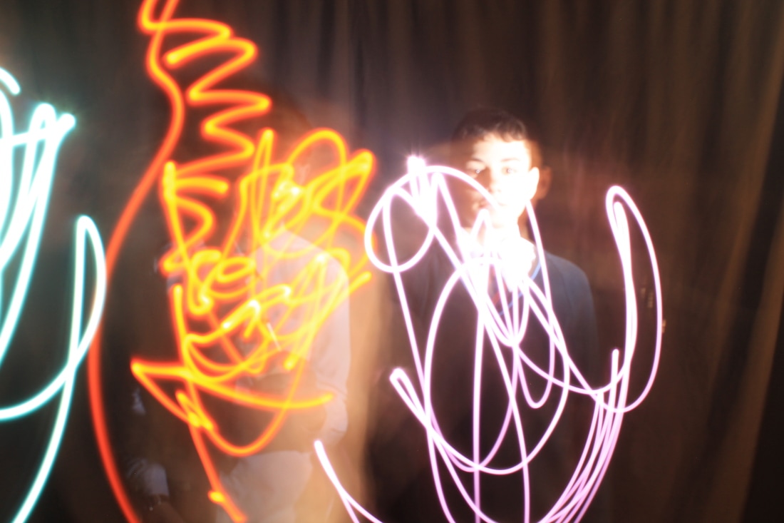
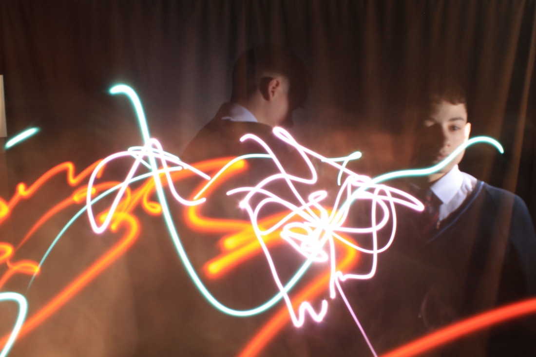
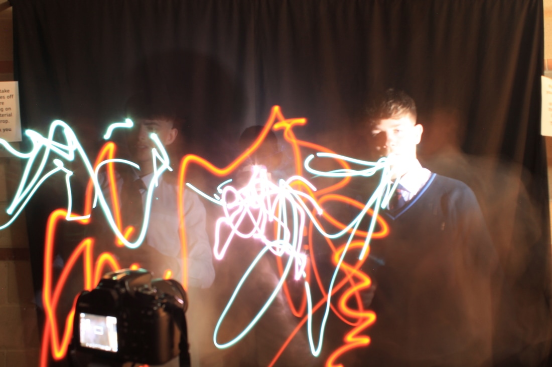
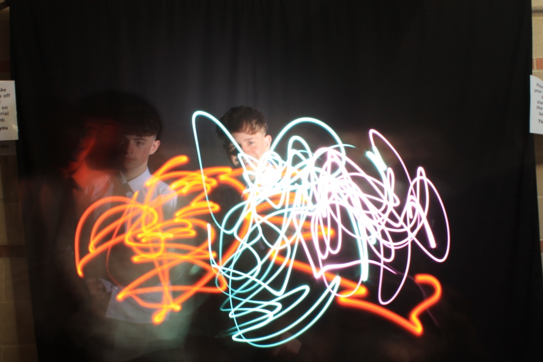
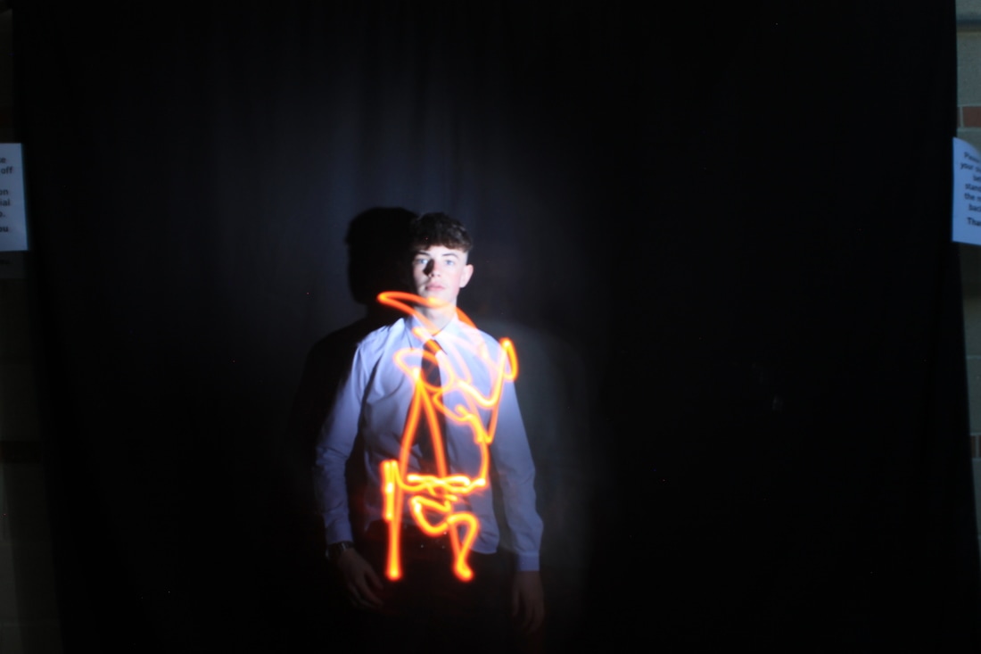
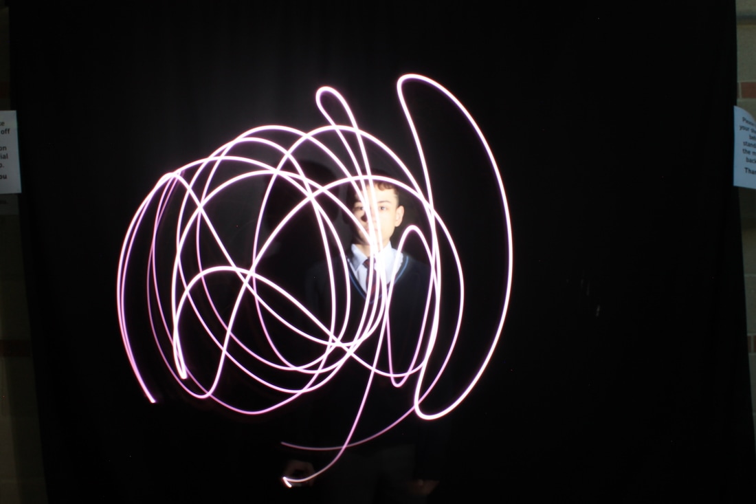

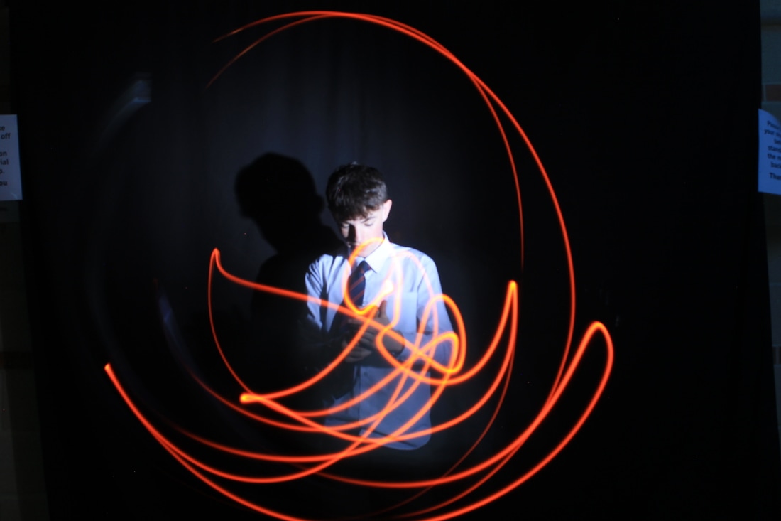
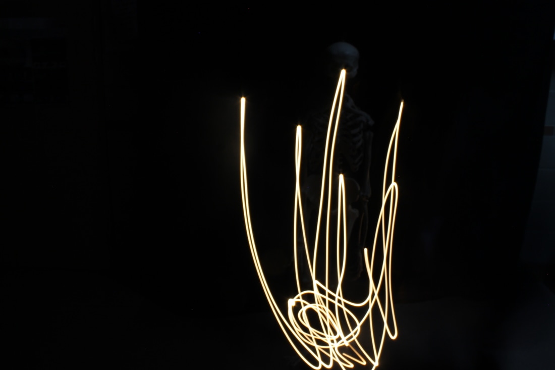
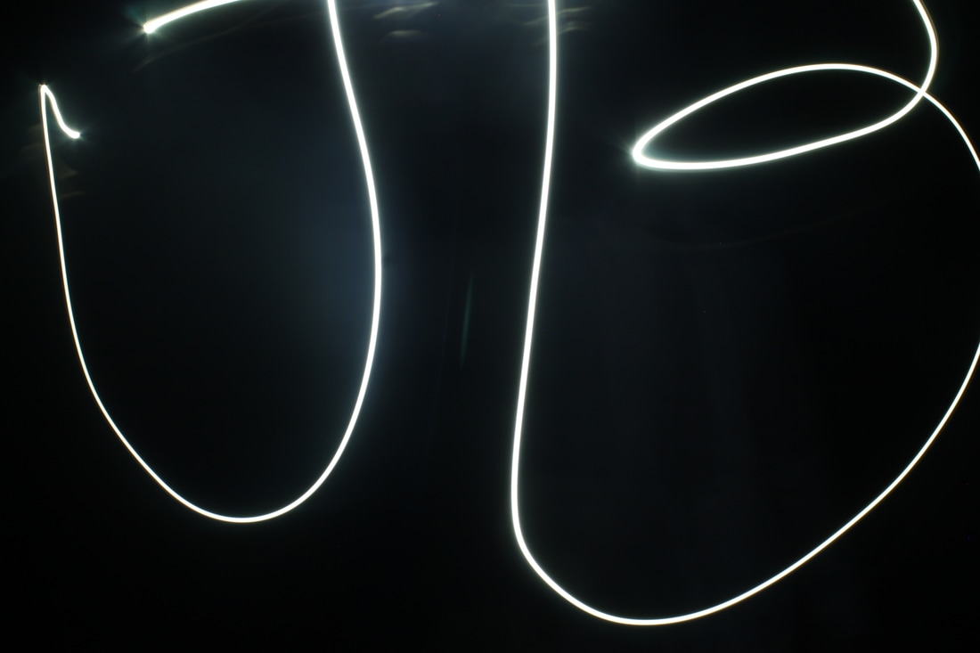
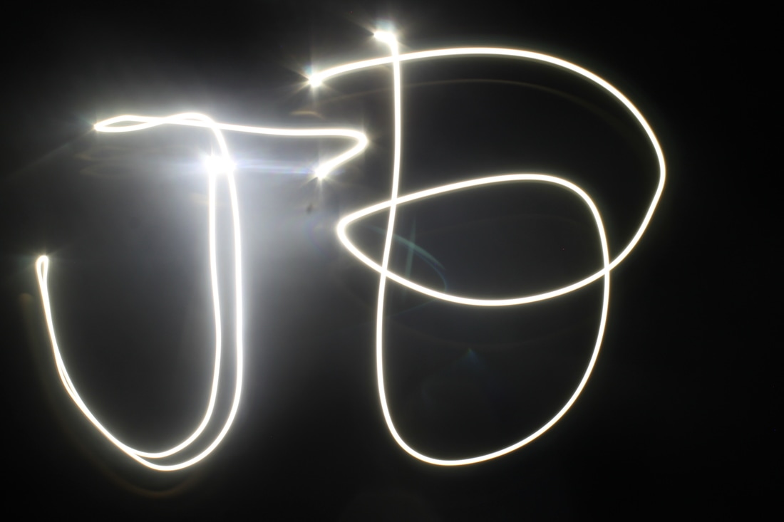
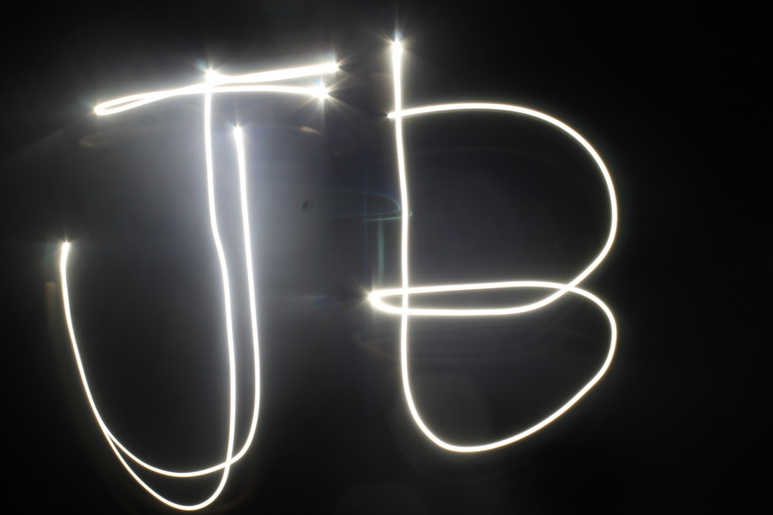
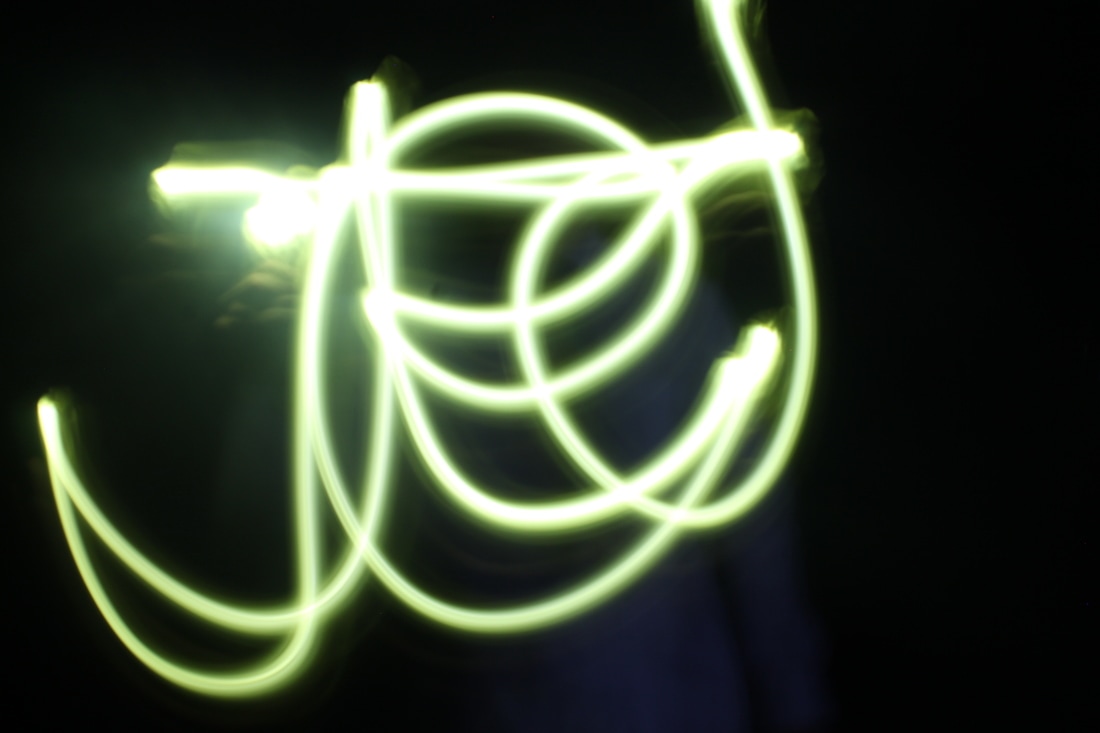
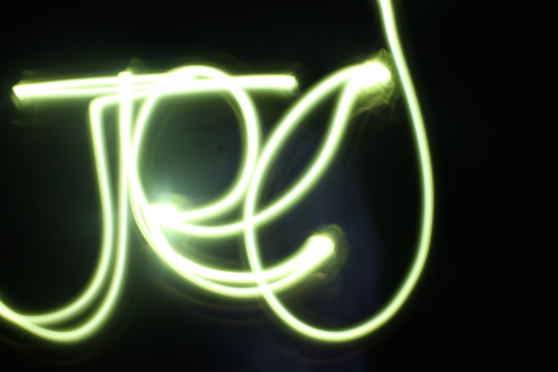
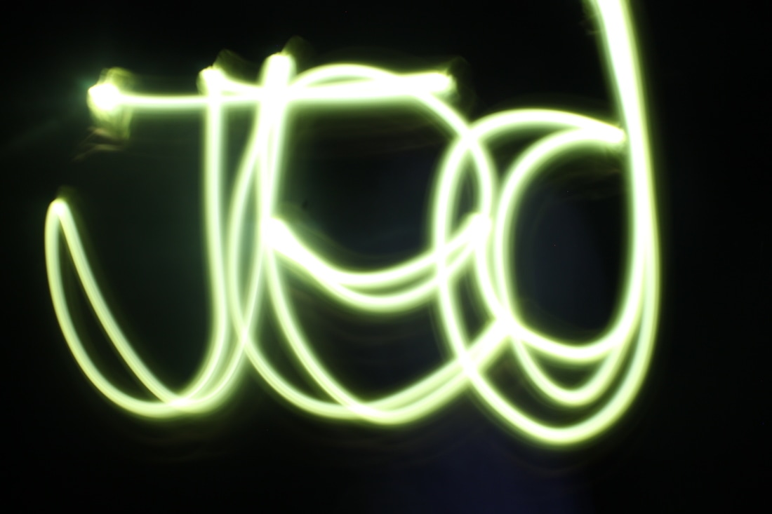
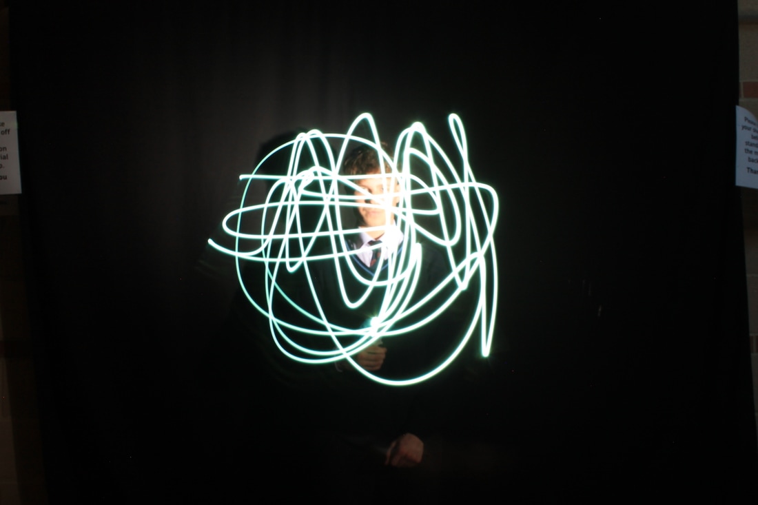
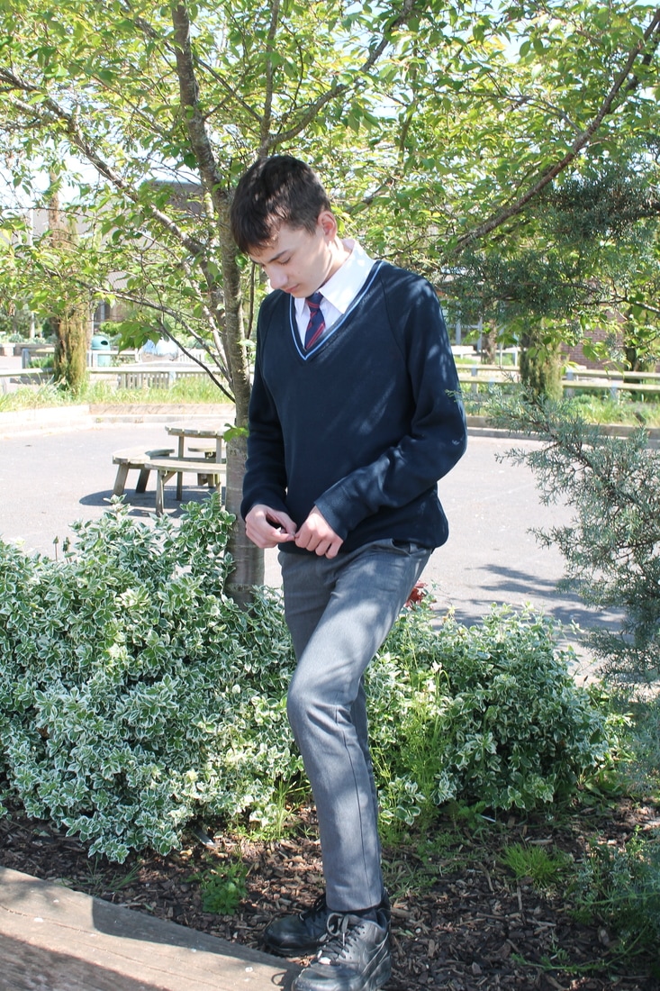
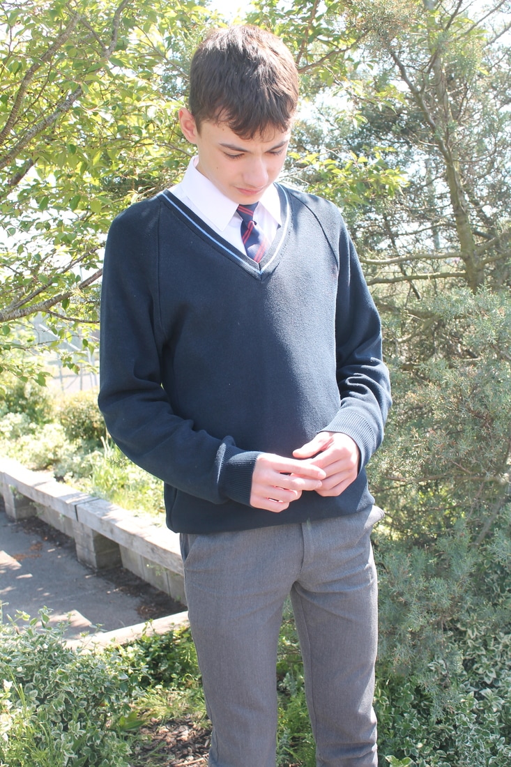
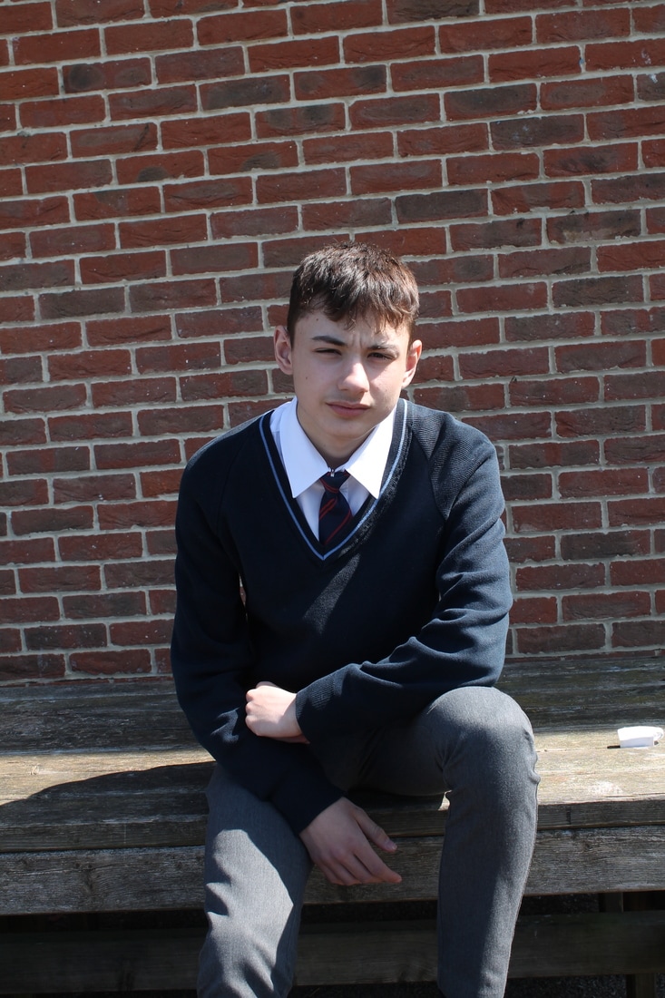
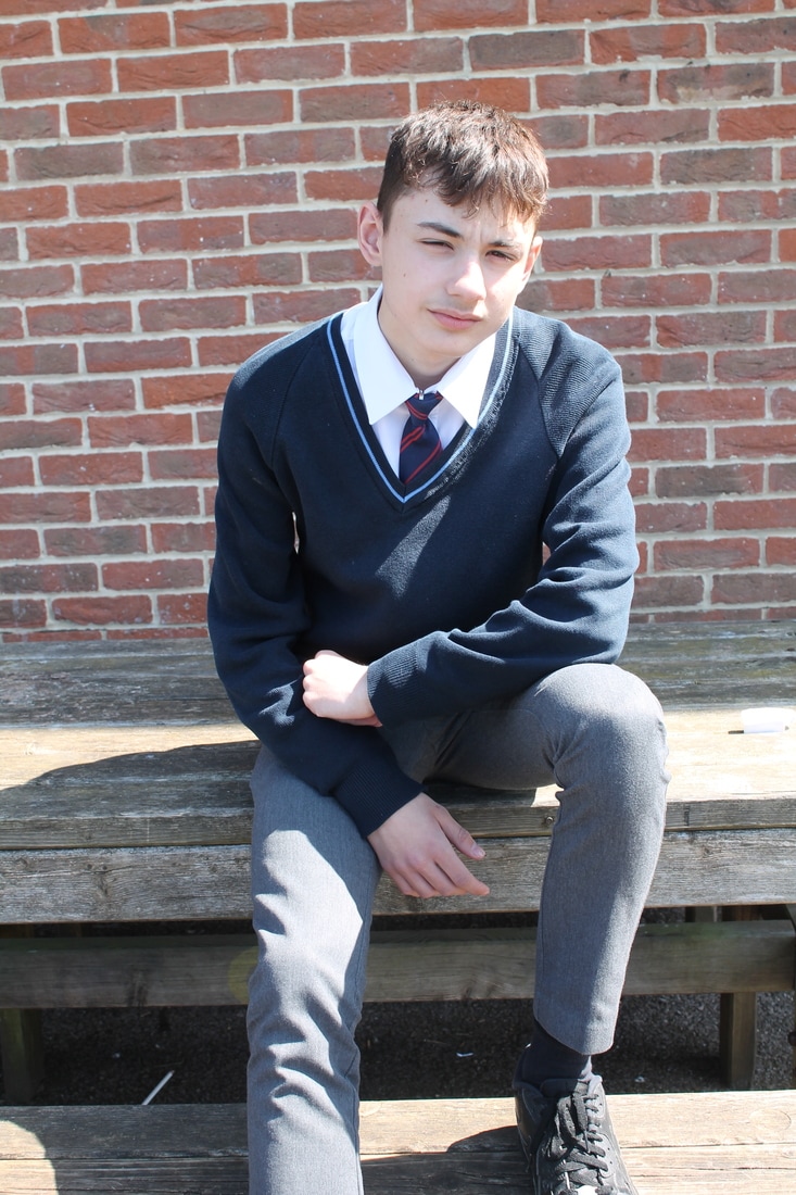
My 3 best images

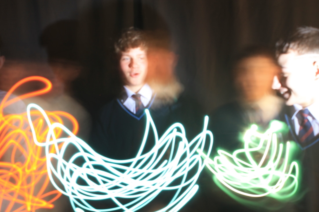
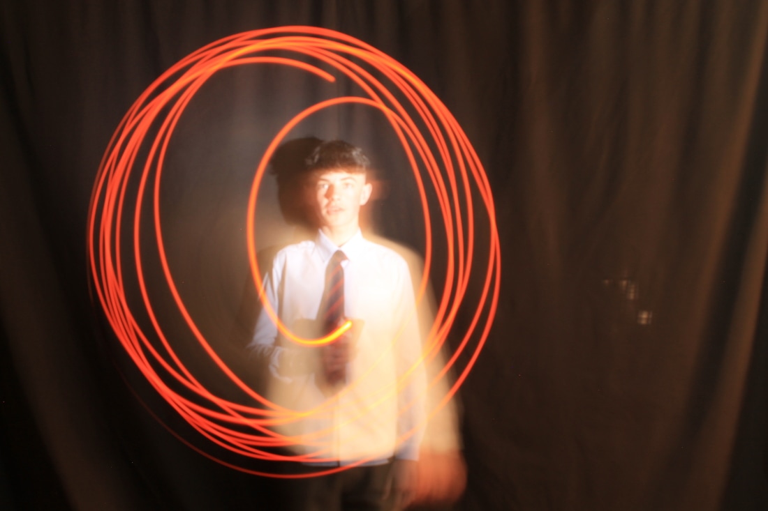
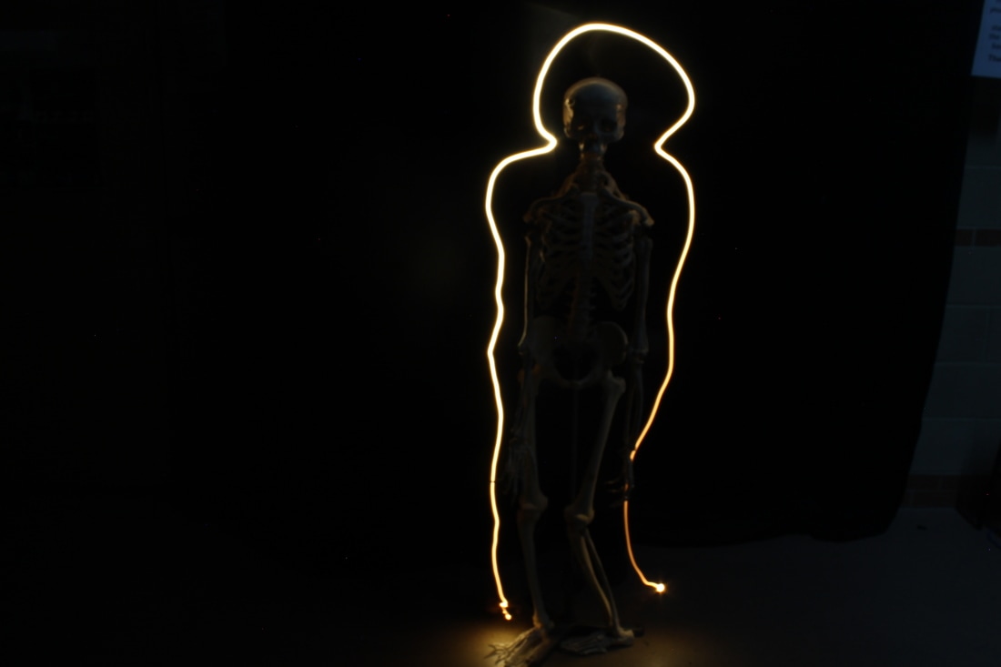
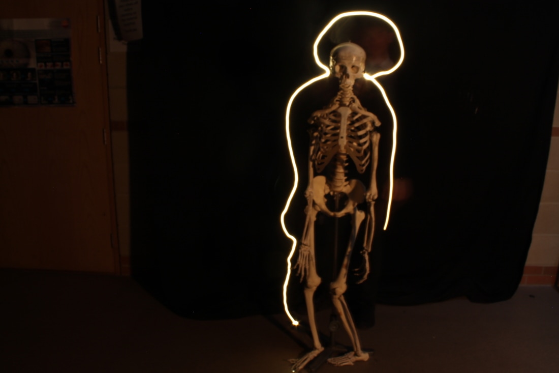
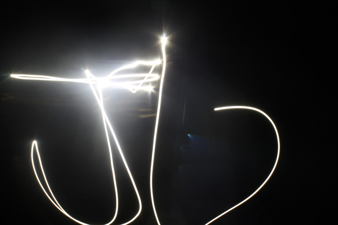
Micheal Bosanko and what to do next...
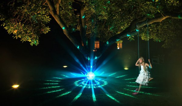
Micheal Bosanko is one of the most famous light trails photographer. In this photo you can see the young girl on the swing and the light trails going around the tree. As you can see my pictures above are similar. I have adapted the idea and have tried doing my own version. Next, I am going to re shoot and try make my pictures look even better, maybe even go outside and take some more scenic photos. But before that I am going to try and edit my photos to make them better.
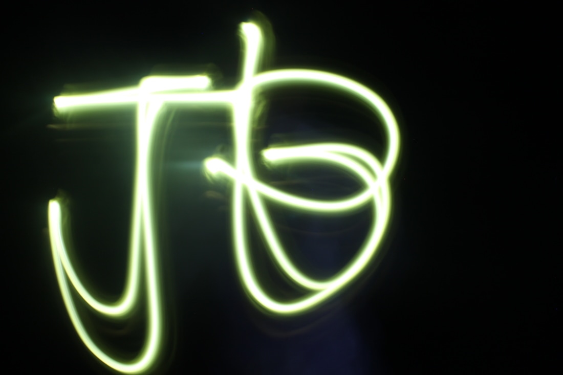
Destroyed experiment
|
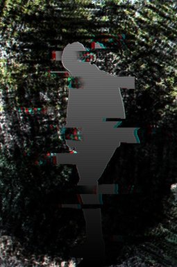
This edit started of as a double exposure piece. I was following a tutorial on youtube and the final bit was to download a brush to finish it off. However, because the school has blocked the ability to download things, I had to improvise. I used a regular brush to create the pixel looking explosion which obviously didn't look as good as the image on the tutorial because of the forced choice of the brush. So instead of abandoning the work I made it look completely different all together. Eventually, I came up with this; completely unrelated to any artist I have studied but it is destroyed. It reminds me off a ghost like figure or something of a video game. You could imagine if this was a real the dark pixely trail that follows the character. To improve I could crop the background down a bit so it focuses more on the character and also change the background to fit the setting
|

|
Glitch technique
|
|
Refinement - working towards final pieceI have decided to combine two of my pieces into one photo. Near the start of the project I researched a way on how to make my work look like it is glitching. I then decided to use this photo and add the glitch effect.
This is my first attempt at doing it. I quite like the piece but I think there is too much going on and it looks a bit too messy. However, this is only my first attempt so I can work on refining it to its best form. Next time I'm not gunna put such a heavy effect on it so you can see more clearly that there is a person there. |
|
|

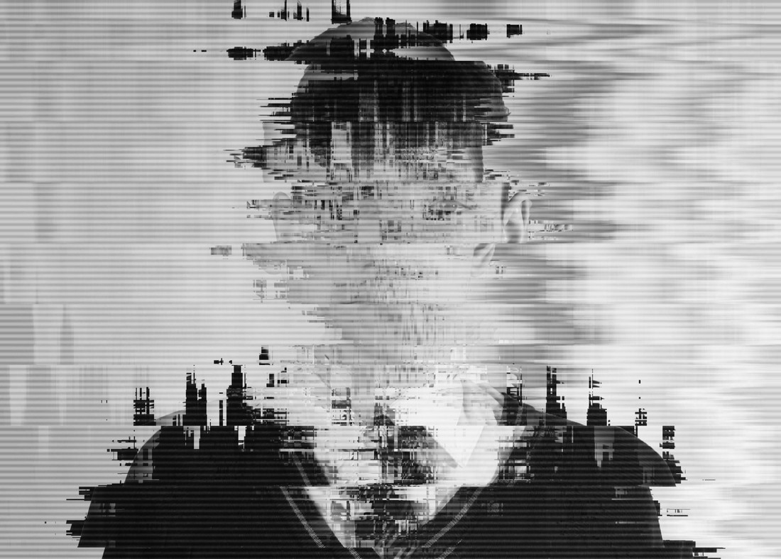
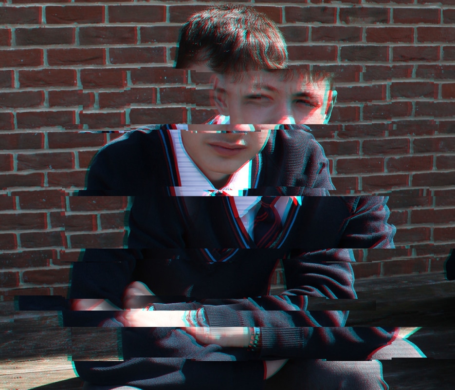
This is my second attempt at adding the glitch to my already edited photo. As you can see, it is much better than my first attempt. My first attempt looks very messy and you cant really make out what it is. However, I feel this version is well improved and more professional looking piece. I used a different technique to my first attempt and I think the picture has largely benefited because there is less clutter in the image. Also, I think it looks a lot more 'glitchy' than my first piece.
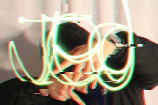
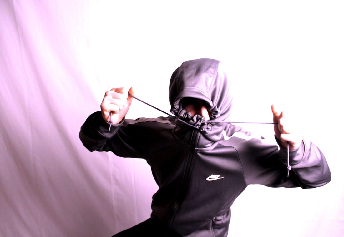
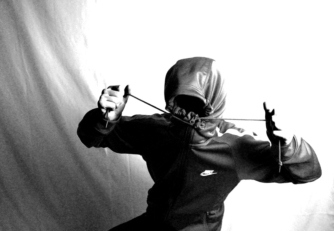
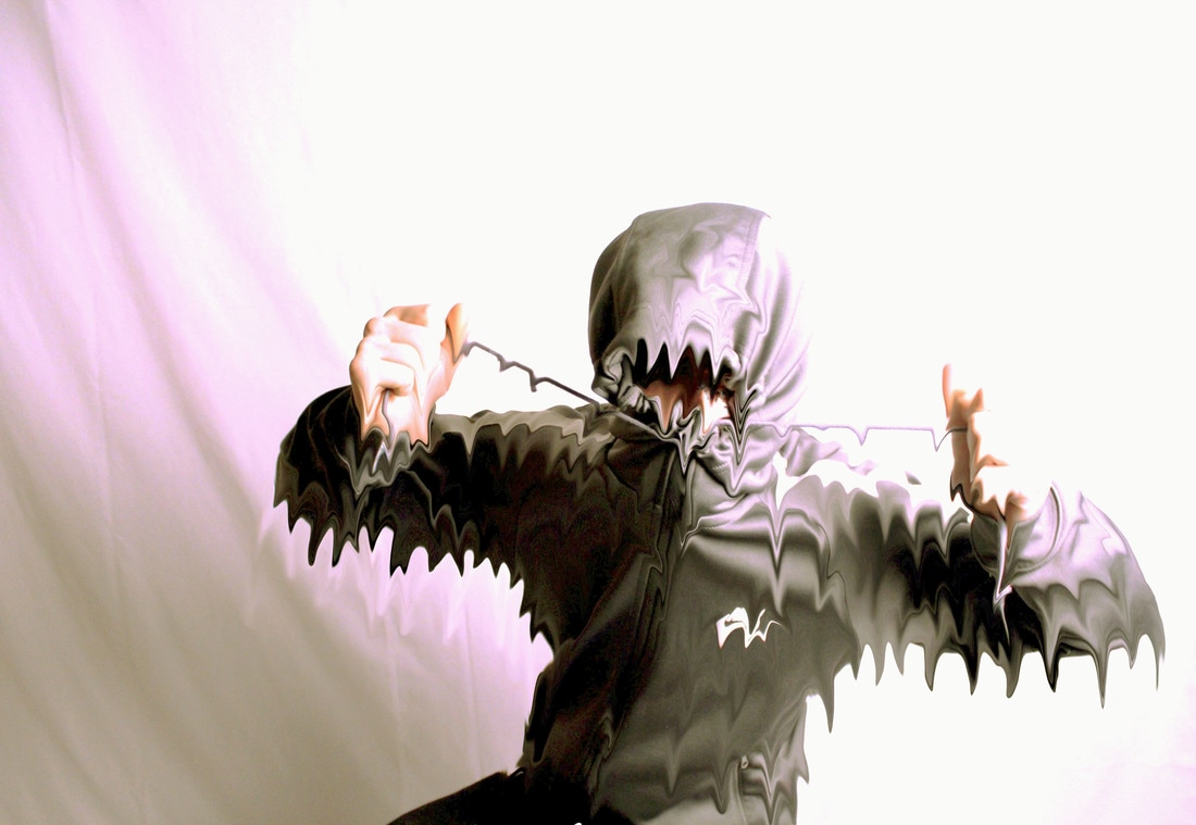
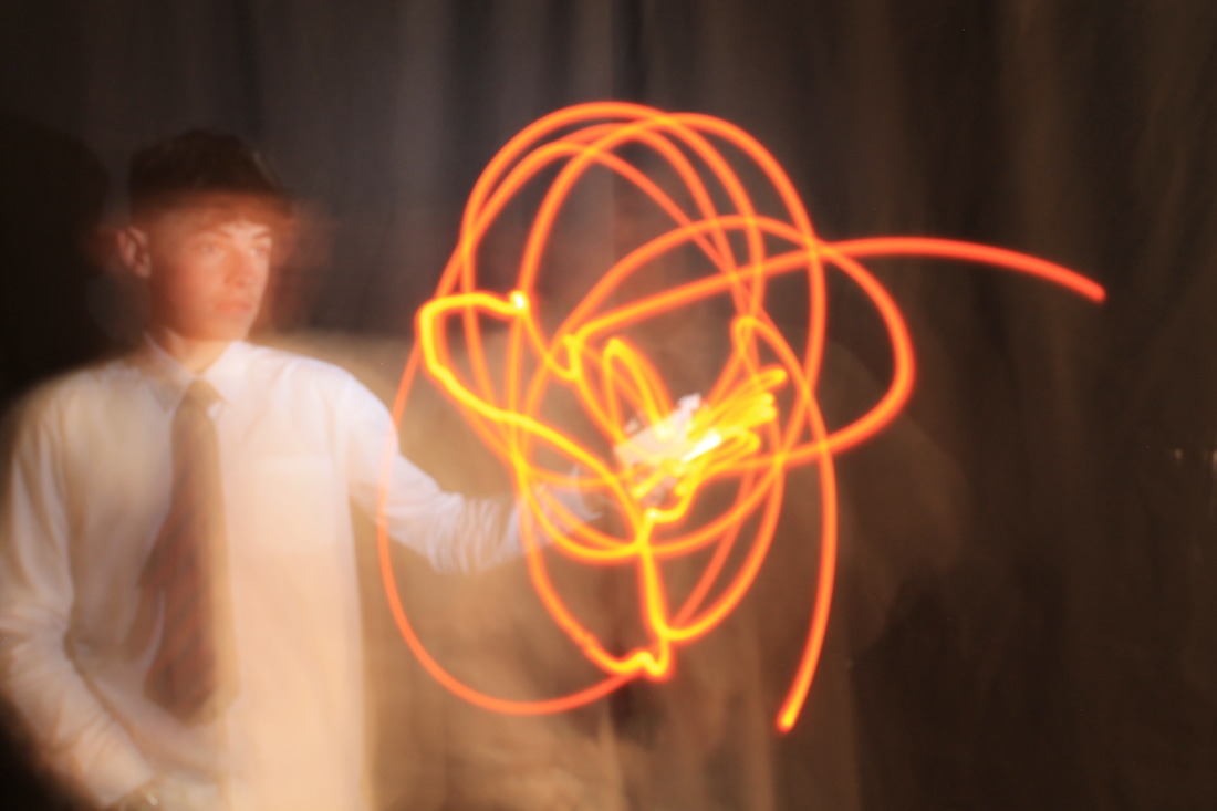
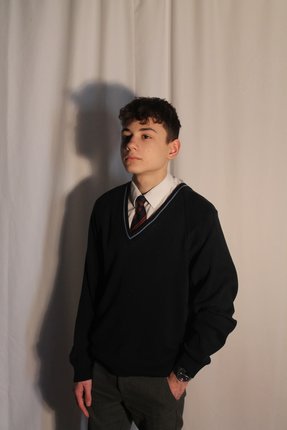
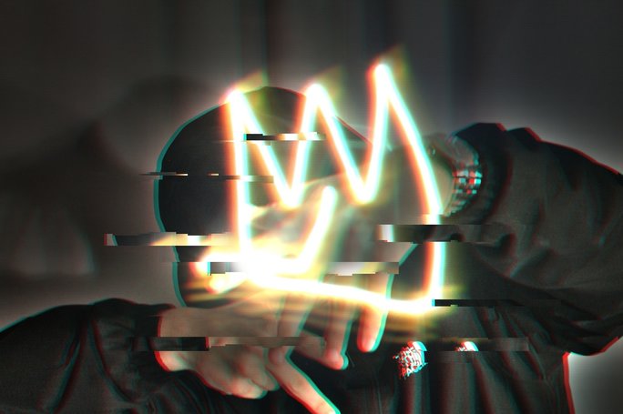
I was given feedback by my teacher to try and integrate my light trails on to my glitch work. I used a photo of me from my friends photoshoot where my face was covered and my hood was up to make it look more mysterious and urban to fit my theme. I then added the light trail I done of my name and put it on top of the picture of myself. Then I proceeded to add the glitch effect and the finished product was this...
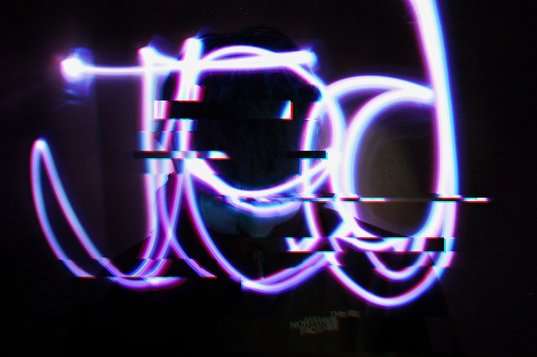
Here is another attempt at doing what my feedback has asked me to do. I have used the same method, but used a different picture in the background. To make the light trail purple and not its original colour (green) I just changed the adjustments on my photo.
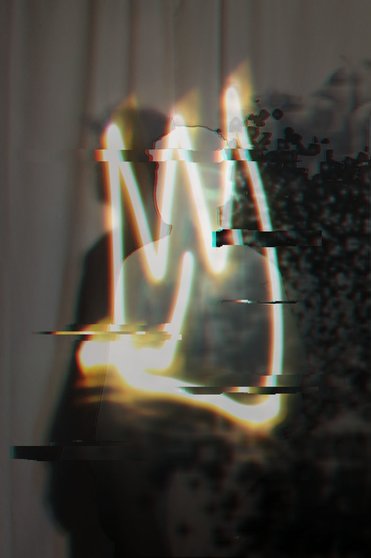
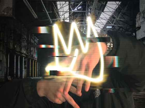
Final work
After a lot of refinement, I have come up with this as my final piece. As you can see, it is similar to my other attempts at this sort of work but instead of having my name written in a light trail form I have gone for a less literal crown shape. I feel the crown works better with the image instead of the writing because it fits in with the abstract theme of destroyed. To create this image I over-laid the lightrail on the background image of me and then added the glitch effect on to both pictures so it would blend better. I also think the picture looks better because it is darker. I done that using HD toning on photoshop.
